Elevating brands
  • Project

Renaissant

Situation

  • Existing brand evolving into new clinic
  • Definition and facilitation of internal culture

Objectives

  • Create an ownable and distinctive brand identity that engages target market and reflects internal values
  • Evolve internal culture and processes to align with new brand and personalised customer journeys
  • Develop suite of branded collateral for new bespoke clinic, internal systems and customer communications

Approach

The brand required a creative strategy that incorporated the existing brand and cultural values, while engaging and connecting to their target market. Taking inspiration from the concept of function and form fusing to create beauty; the visual execution, and layering of meaning within the brand was developed.

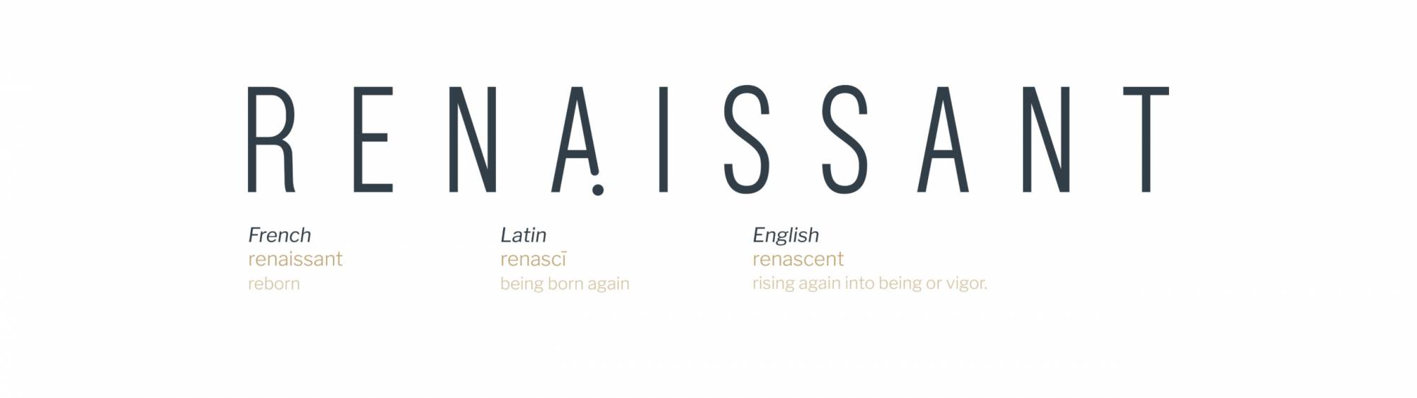
The new name, Renaissant, is the blend of the Renaissance period, a time of rebirth for art and beauty (form) and science (function), as well as the concept of ‘renascent’, which describes being born again.

Renaissant definition on white background
Renaissant- brand promise in gold

The brand promise ‘Always You’ reflects the brand’s client-centric services and aligns their internal culture to deliver on this promise and promote the beauty of individualism.

Close up of a mans face with hand on jaw-internal culture
A man and woman dancing in formal attire- internal culture
Woman smiling with hand on face- internal culture
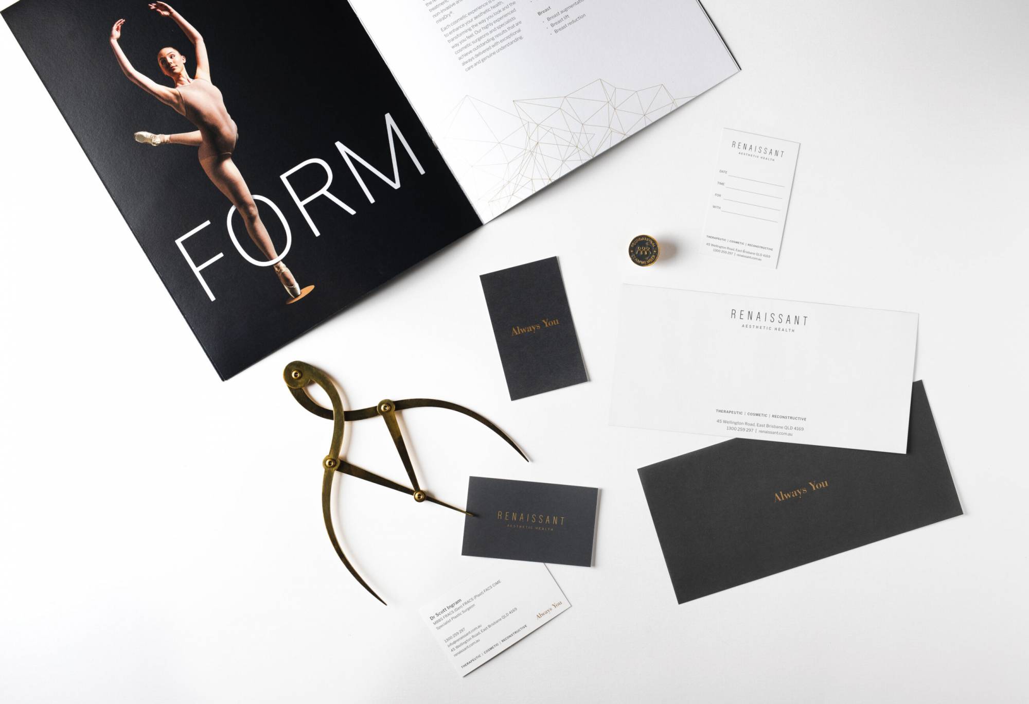
“Our focus is Always You. We celebrate and respect your uniqueness and inspire you to be the best version of yourself. Whatever your goals, we guide and support you every step of the way. ”
Ballerina dancing on white background-form and function

Visual Identity

The visual identity needed to be a multi-layered solution to give creative direction for the bespoke clinic and communicate the aesthetic and culturally significant brand identity. Ballerinas embody beauty, form and function and work as a visual device across the brand’s collateral. The brand used ballerinas being ‘en pointe’ as inspiration for the dot, or ‘point’ in the brand promise, brand name and marketing collateral. This visual element also represents an iconic ‘beauty mark’ to symbolise the brand’s offering of unique and crafted experiences for every client.

Renaissant branding examples- form and function

Outcomes

Renaissant has wholeheartedly embraced their new brand, implementing and aligning the brand identity across the entire business. They were able to trademark their business, elevate their brand and establish a competitive position in the market.
Do you need to evolve your brand and define your internal culture? We’re experts in branding, strategy, digital and marketing, so connect with us here.

Similar projects

NOFOMO - New Fitness Movement logo- unique brand identity

NOFOMO

Brand Personality & Voice
Toowong Orthodontics brand identity and marketing strategy by Brisbane brand agency DAIS

Toowong Orthodontics

Marketing
Click me for a free brand health report!

Step 1 of 11

  • Our brand name is unique in our industry and marketplace.