The business lacked on overarching brand that connected sub-brands and clearly communicated their value proposition to stakeholder groups
The brand required a way to connect, bridge and identify themselves as a brand with a defined philosophy to claim a clear space in a highly saturated market
Brand identity needed to reflect uniqueness of their service offerings
Objective
Create a brand that shows a unique style and vision beyond just technical and geographic locations
Develop a brand identity that reflects vibrancy and inclusiveness of the centres
Establish an industry leading market position that engages target markets and communicates competitive value proposition
Approach
After an internal engagement process, it was clear the brand had a unique point of difference in their philosophy for learning and teaching. This inspired the new brand creation, internal culture and external communication strategy.
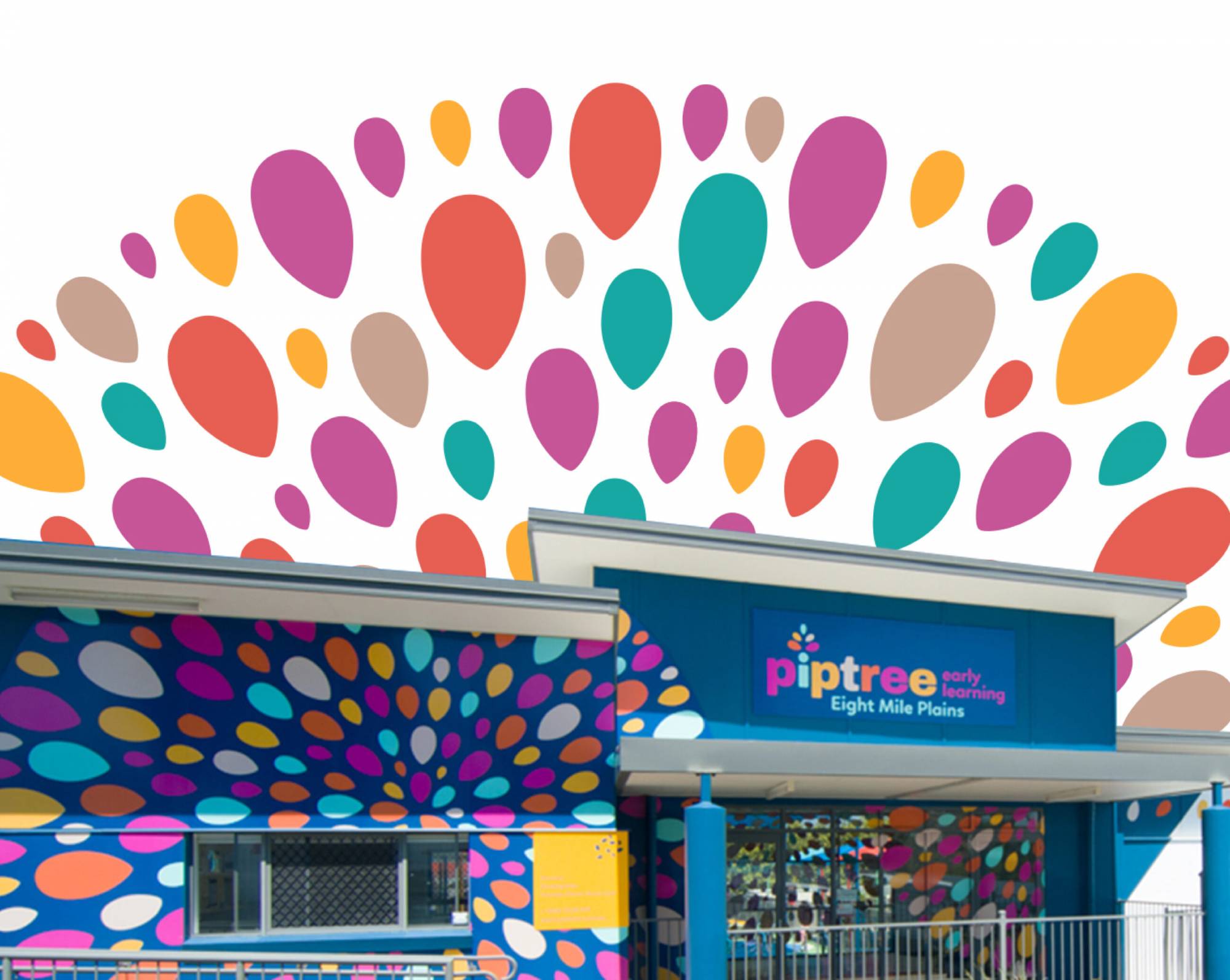
The new name Piptree is based on the brand’s focus on deeply nurturing children’s development and facilitating a journey of care and learning, from pip to tree. Clear solution streams and a unique brand promise, begin to blossom, were introduced to claim a distinct position in the market. These elements communicate the brand’s philosophy of helping each child find their own way to flourish, starting with the first step, and that the centres are a melting pot of all cultures and beliefs. With this new brand-identity the sub-brands are aligned to a universal way of thinking, understanding and talking about the brand.
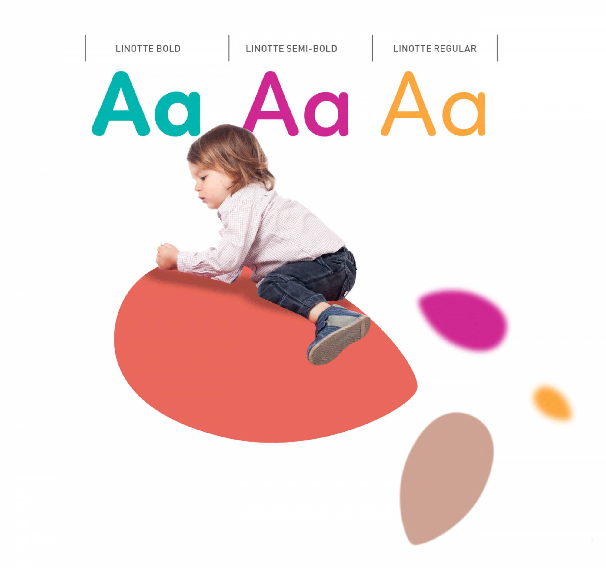
A dynamic and bold visual identity was developed to reflect the brand’s new identity and philosophy. Combined with a bright colour palette and an easy to read typeface, the visual identity was designed to engage and excite both parents and children. The brand icon and visual identity pattern were inspired by shapes in nature to be reflected of Piptree.
Outcomes
With an engaging visual identity and distinct brand identity, Piptree is able to claim a market leading position and clearly communicate their value proposition. Management and staff across all centre locations have a common benchmark standard and understanding of what the brand stands for, which is driving consistency across the business and building a stronger brand identity with all external stakeholders.