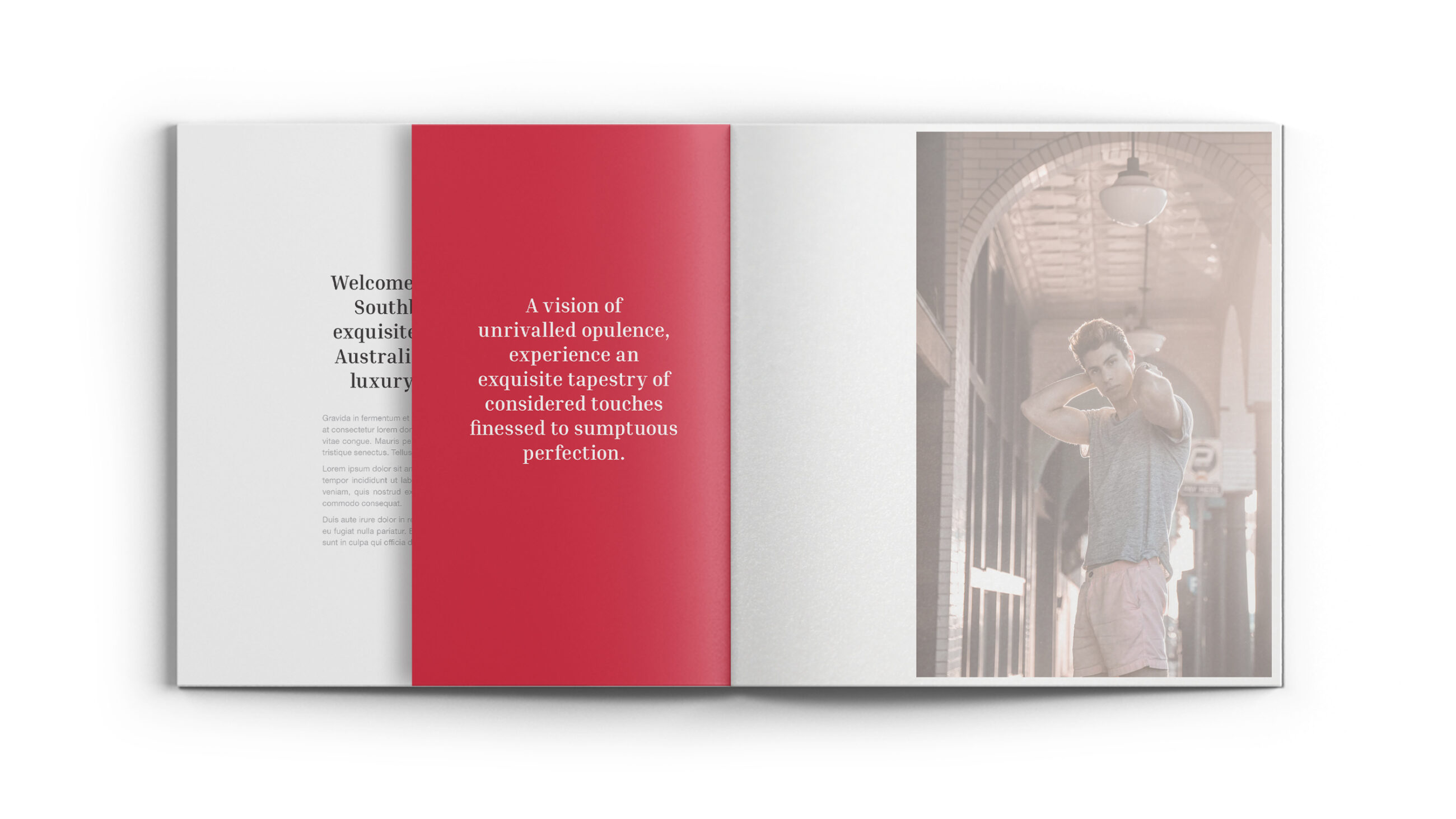
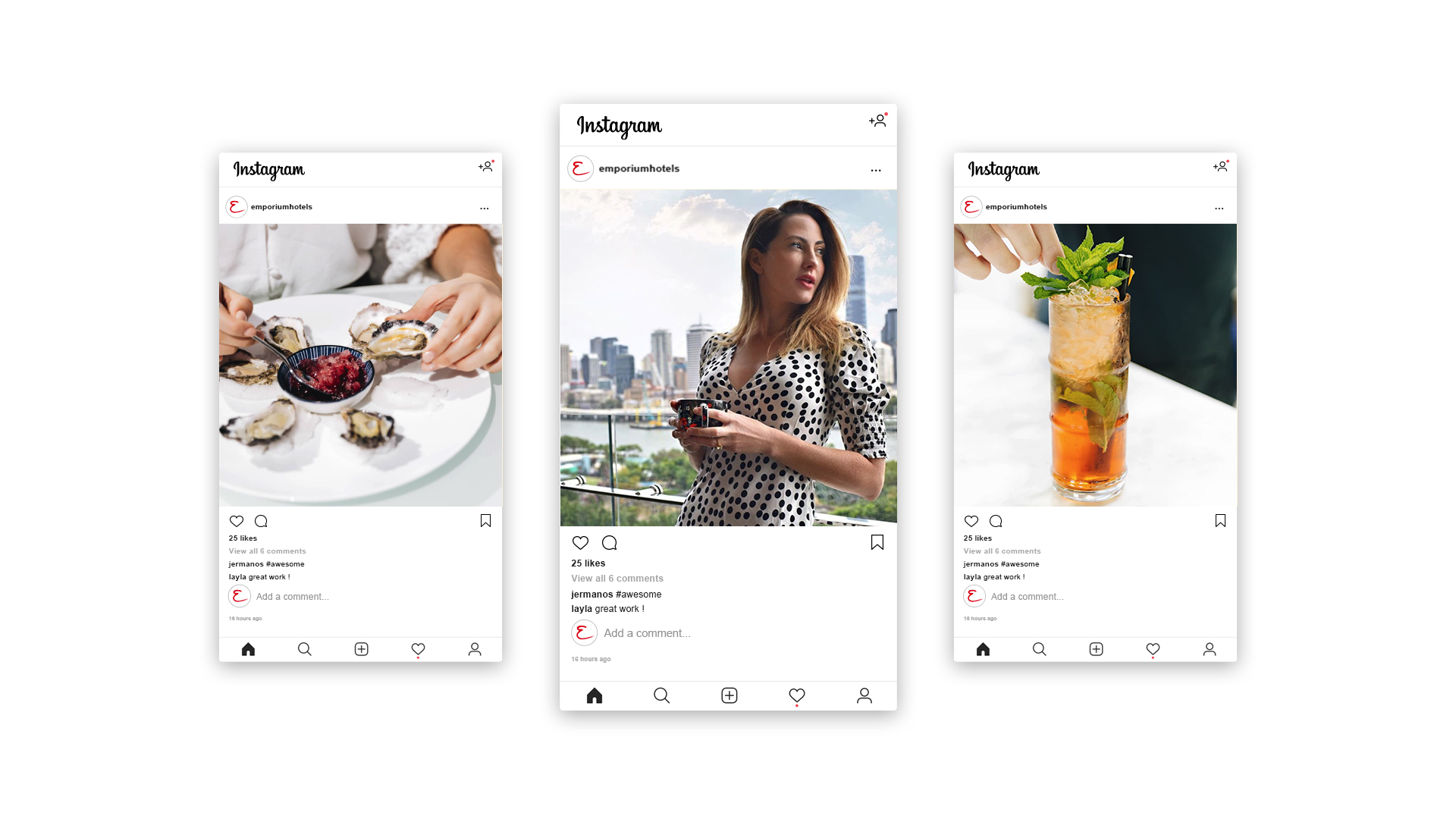
Every detail is a considered touch, elegantly crafted to create a vision of exquisite and incomparable splendour
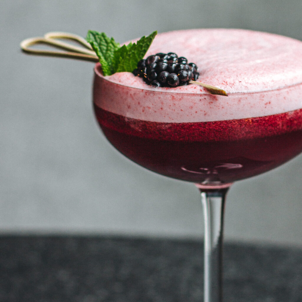
2017 saw Emporium Hotels move from their location in Fortitude Valley to the coveted and bustling precinct of South Bank and required a brand evolution that would give their brand the strength to expand and cut through the cluttered luxury market.
DAIS facilitated the transition by updating the identity for Emporium through introducing new sub-brands and brand positioning language whilst still retaining the core brand identity. Maintaining the brand promise ‘exquisite stays’ was important for its key messages of luxury, exquisite experiences and the hotel as an aspirational destination.
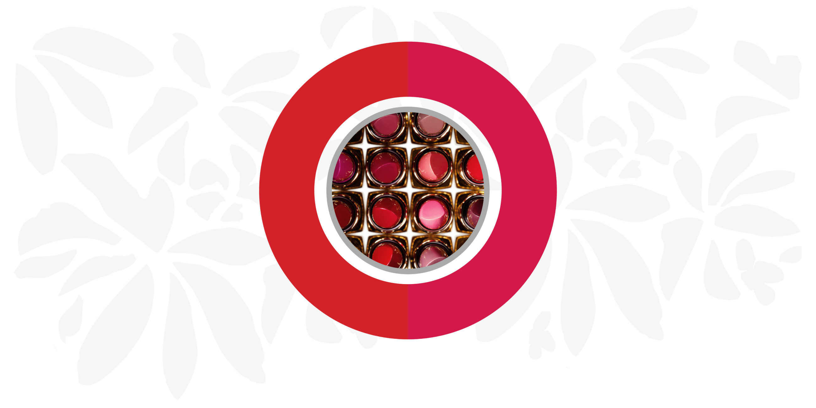
Visually, the primary colour palette was upgraded to a deeper shade of red, introducing ‘Emporium Pink’ to accompany the logo along with ‘Cool Grey’ silver. ‘Inria’ was presented as the new typeface for its sophistication and elegance – a fitting match for Emporium along with the visual identity combining depth in colour with subtle textures to take the brands aesthetics to the next level.
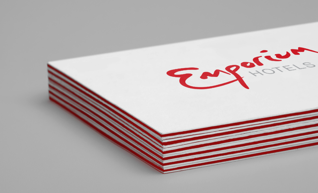
Through their brand evolution, Emporium Hotels has strengthened and grown whilst maintaining their well deserved reputation for being an aspirational destination.
From being inducted into the Queensland Tourism’s Hall of Fame in 2014, named Australia’s Leading Boutique Hotel for the third consecutive year at the World Travel Awards in 2017, and sub-brand ‘The Terrace’ named 2019’s best Boutique Bar at the QHA Awards, Emporium continues to gain national and international acclaim for their exquisite stays.
The Emporium Hotel is an aspirational destination, catering for the exquisite elite; every moment with us is a reflected smile of unanticipated sensory delight.

