The existing vineyard was named Balancing Rock after a unique granite rock formation on the property. So, we felt it was important to continue to use this distinctive rock to create a sense of place and destination. What had been missing from the brand story, however, was heart or emotion.
Ironically, the top rock is the shape of a heart, so we elevated this idea to create Balancing Heart. As well as this, it reflects the delicate balance of passion and intelligence in winemaking, while still retaining reference to our special rock duo.
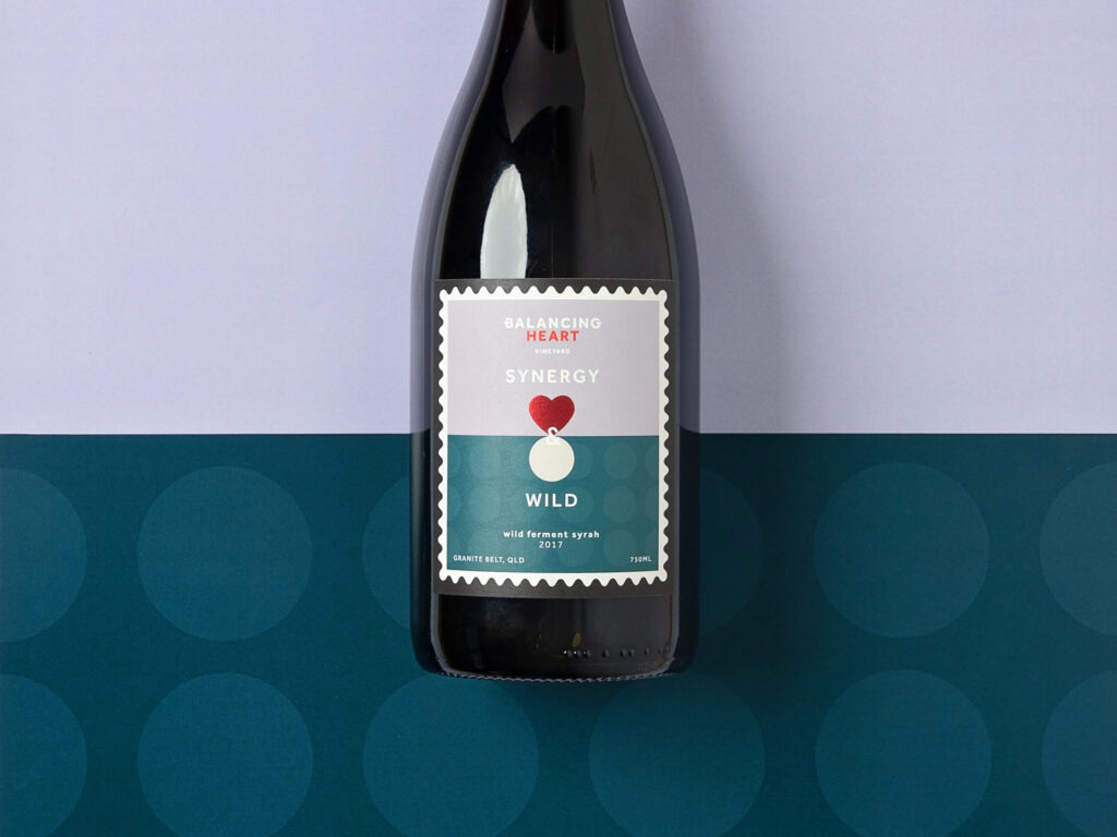
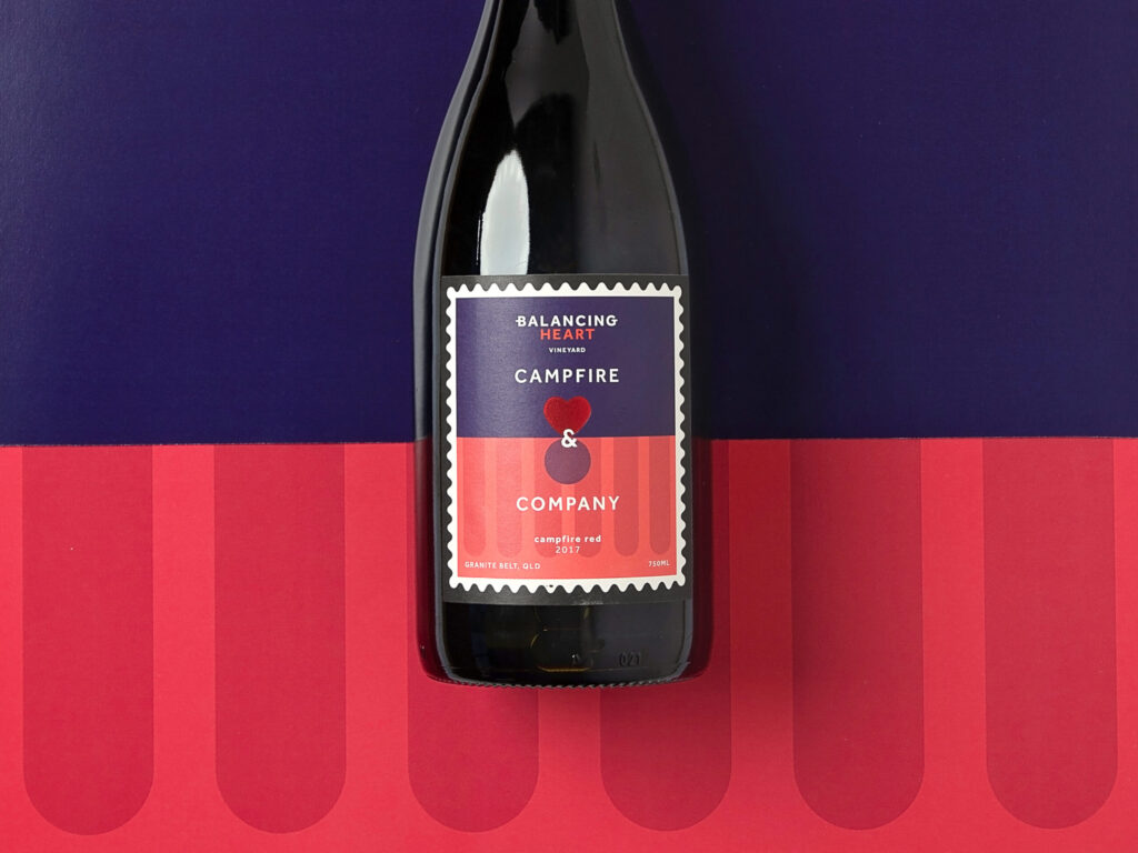
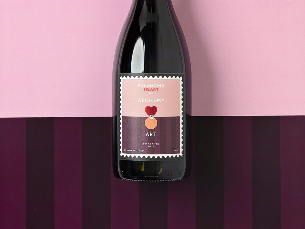
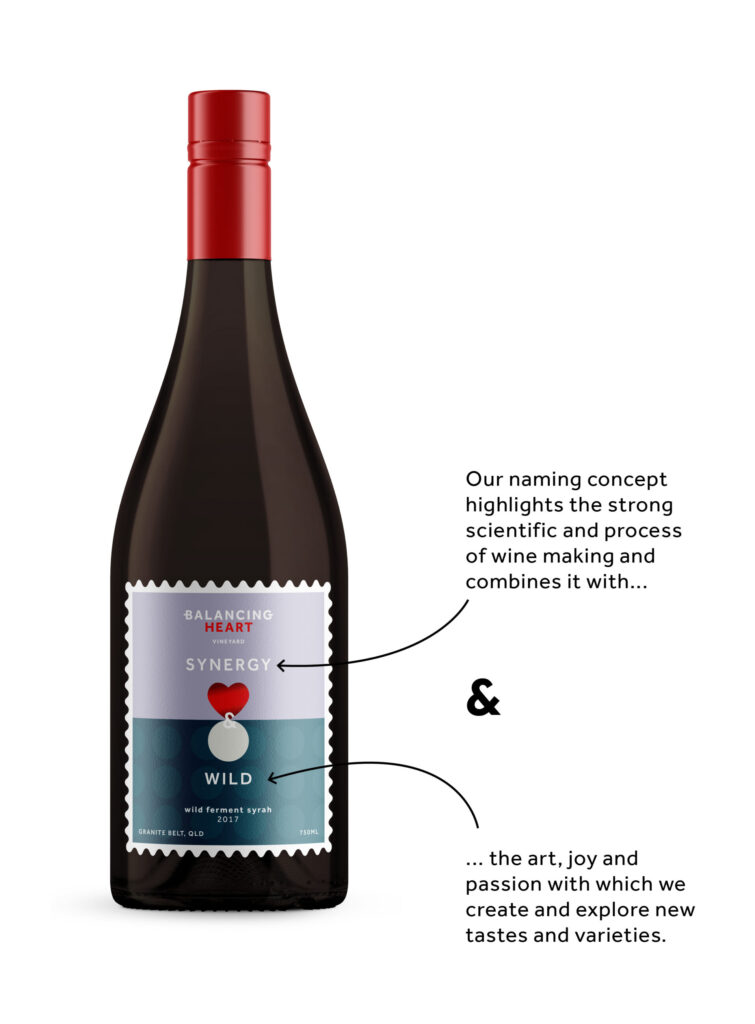
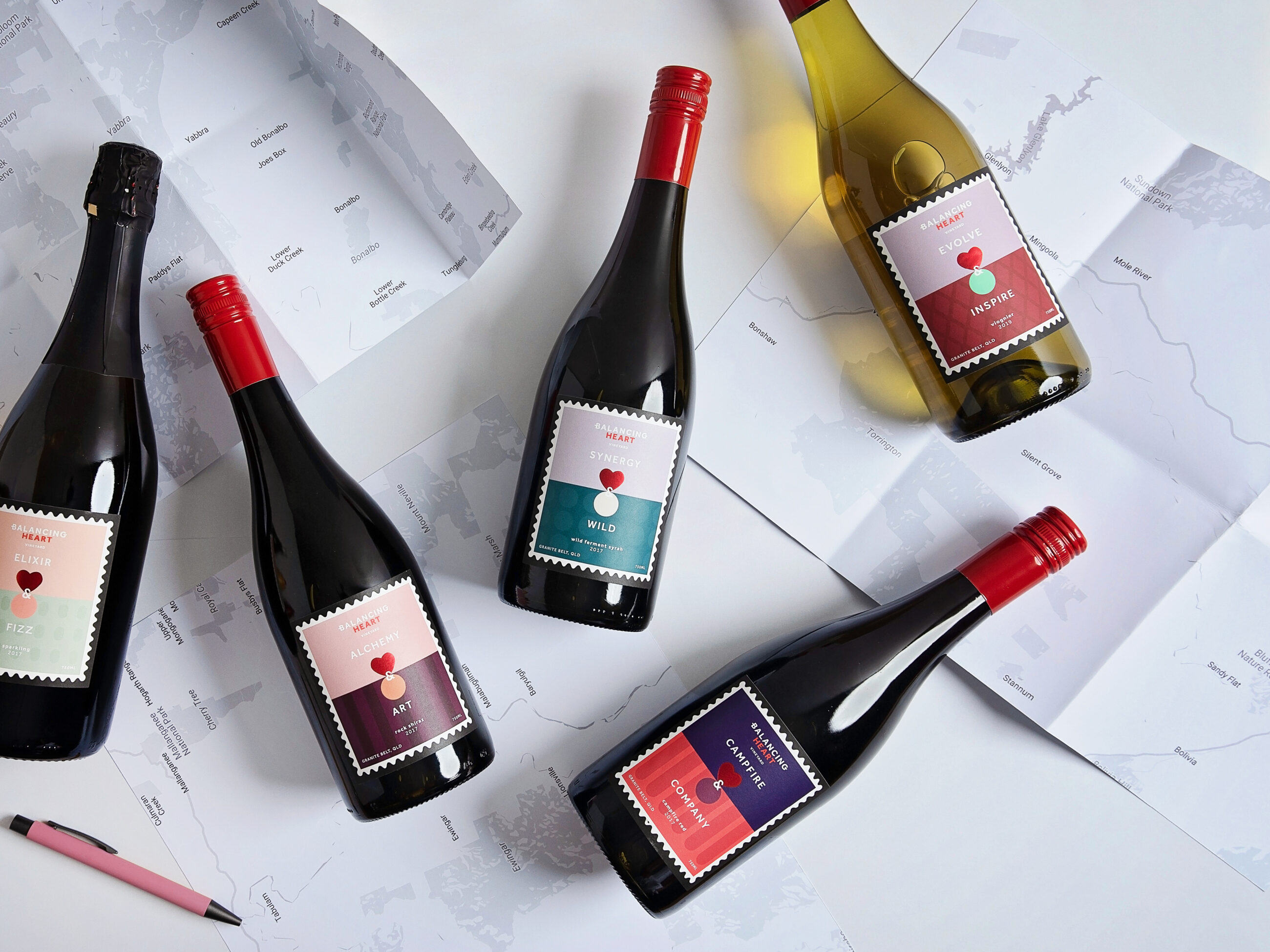
We created conventions for naming wines and creating label artwork that would be true to the brand philosophy, impactful on shelf and easy for the owner to manage. This simple two word naming and design convention speaks to the duality of the brand. It also highlights both the science and art behind producing quality wine.
With a strong branding and packaging strategy, we planned a relaunch strategy and ongoing tiered marketing strategy. Specifically, this included a social media content framework for launching a new vintage, the revamped Cellar Door and the new architecturally designed tasting rooms.
We specialise in balancing the unique soil profile, cool climate and abundant sunshine to craft unique wines with heart
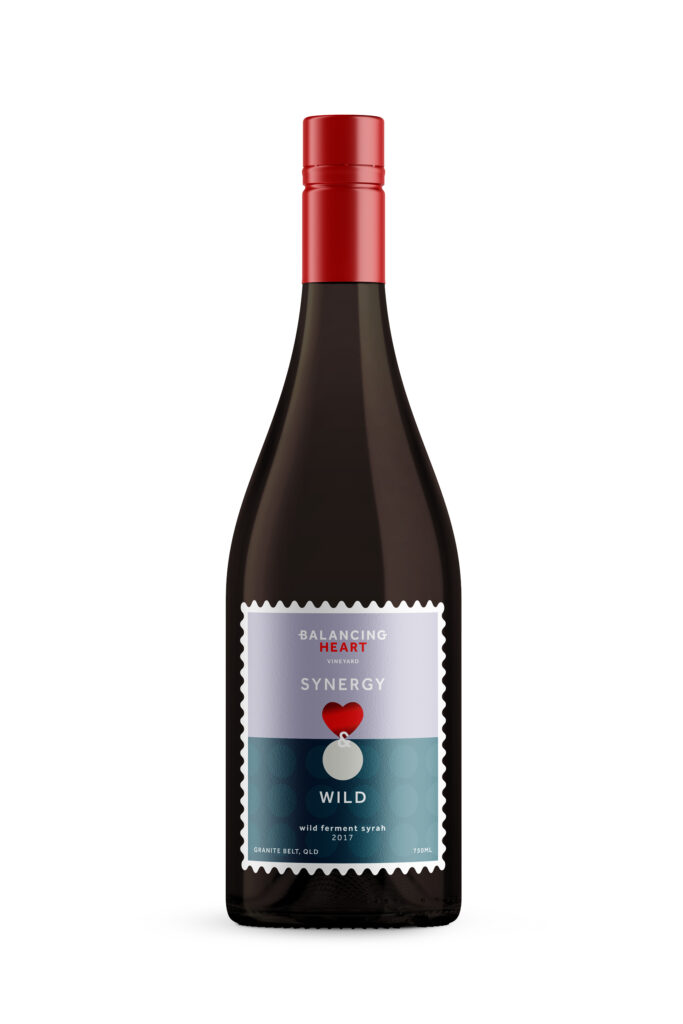
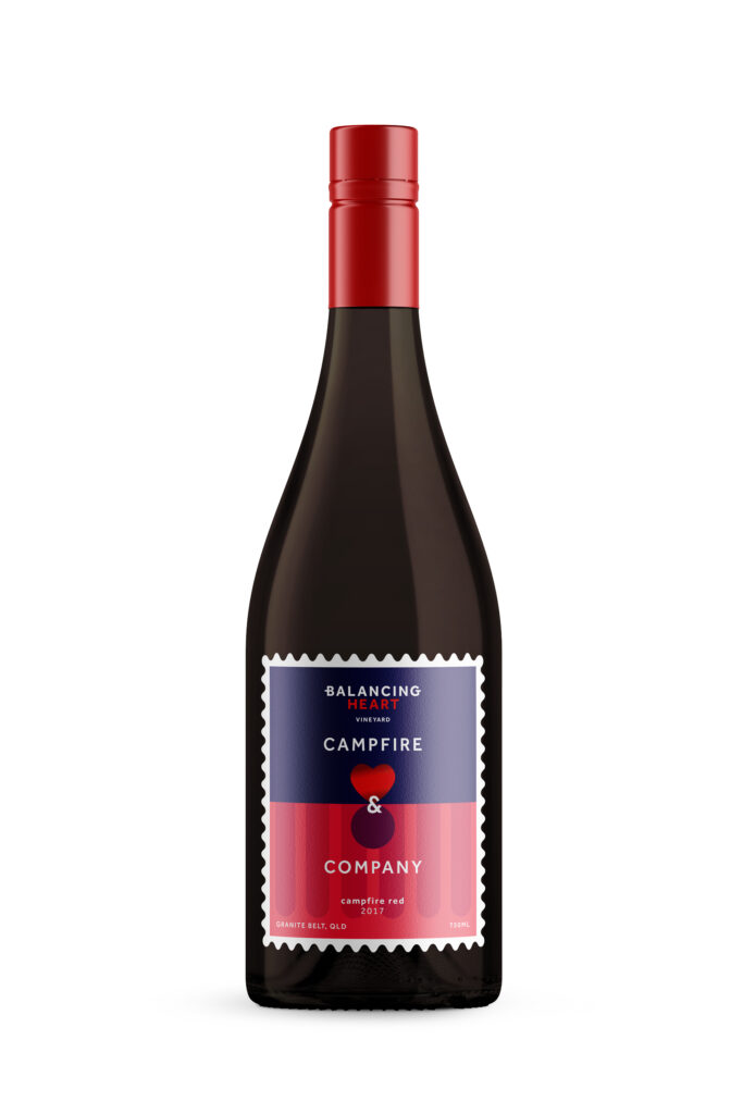
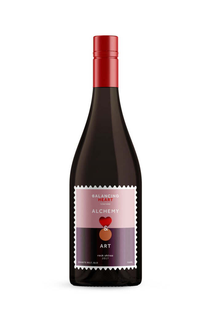
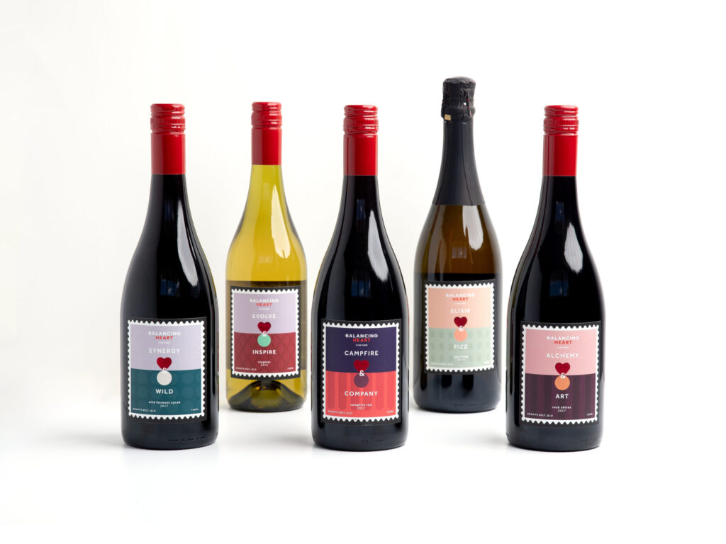
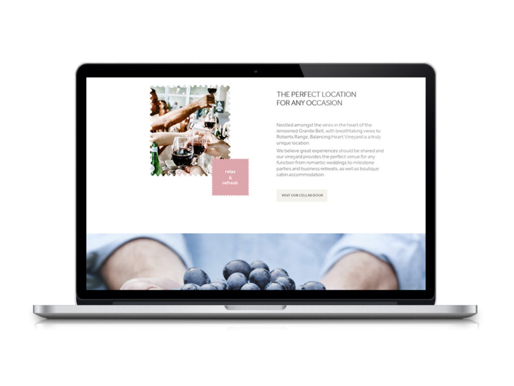
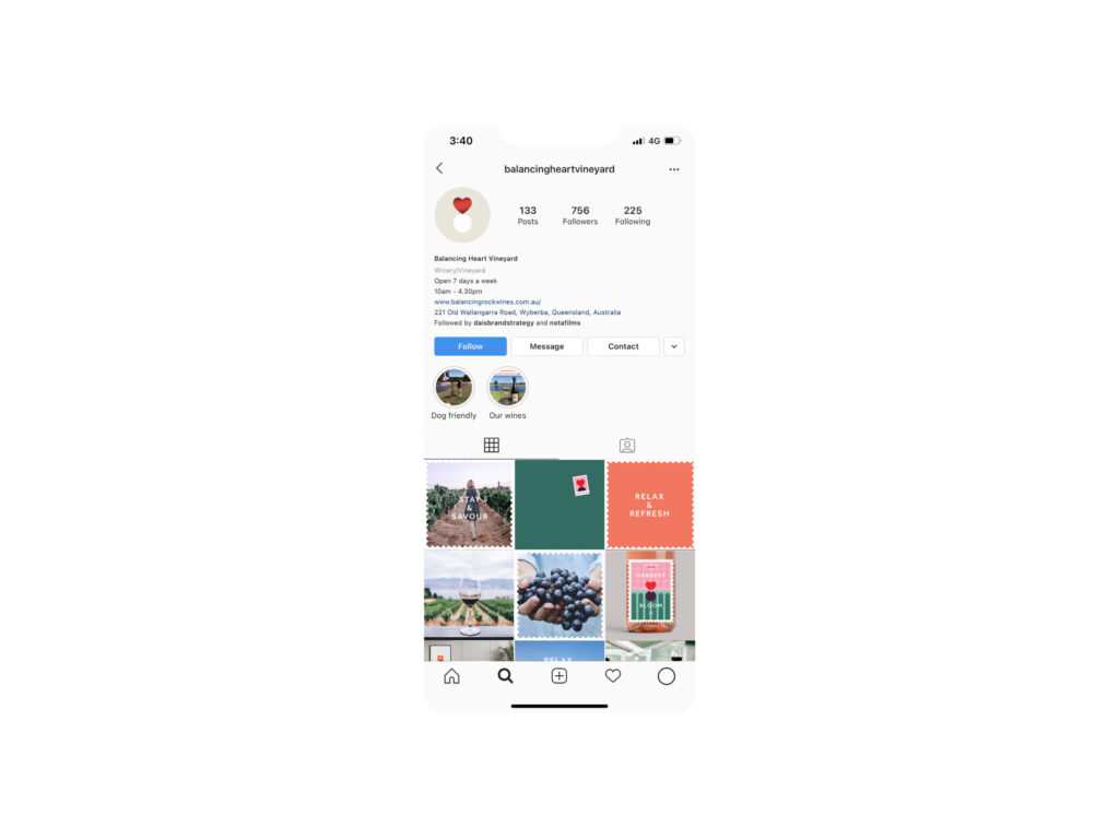
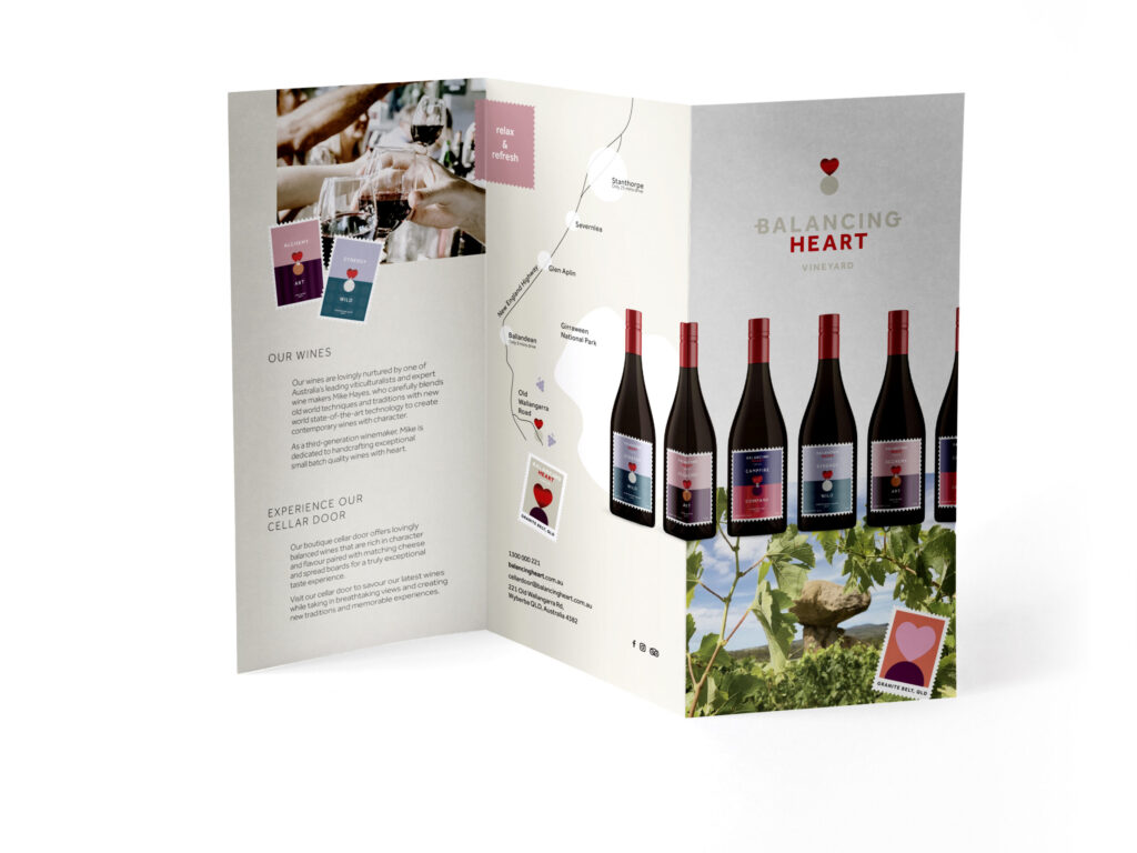
So within weeks, Balancing Heart came to life as we worked with the enthusiastic owners to launch the new brand. Specifically, this included an engaging website, impactful graphics for their social site, signage and a suite of brochureware and collateral. There’s also a giant Balancing Heart bottle at the gate of the vineyard!
Overall, the relaunch has been a resounding success, with the vineyard busy with tastings at their new Cellar Door, showing at festivals and launching new wines. Also, there are exciting plans in place for a range of new varietials and blends. Specifically to take advantage of the unique soil profile, cool climate and abundant sunshine to craft a new generation of wines for Balancing Heart.
