DAIS helped us create a unified brand identity and tone of voice that not only reflected our business strategic vision, but also supported our ability to engage meaningfully with a diverse range of stakeholder profiles.
For over 60 years, Relationships Australia Queensland (RAQ) has provided vital relationship support services. As part of the national Relationships Australia federation, RAQ had accumulated a range of solution streams that diverged from their principal mission, resulting in a fragmented brand that struggled to communicate effectively with all stakeholders.
The goal was to evolve this historic organisation into a cohesive, modern brand experience with a refreshed identity that would enhance its contemporary relevance and amplify their powerful message of hope.
RAQ had just developed their business strategy and partnered with DAIS to bring it to life and align it to their brand strategy. DAIS clarified the vision, shaping building a tangible and actionable brand strategy that could be launched to their staff, customers and the greater community.
This strategy led evolution inspired the rest of the Relationships Australia federation to share in the vision and adopt it nationally.
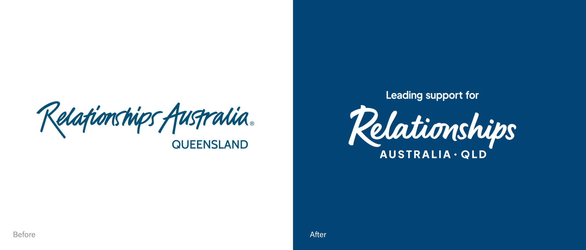
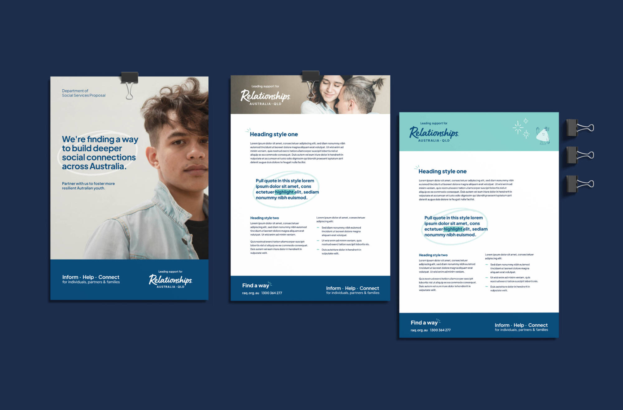
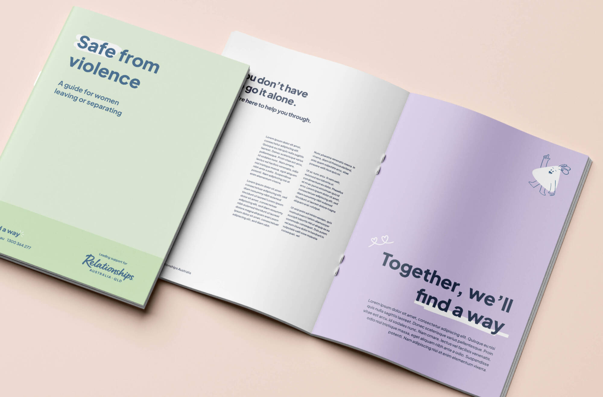
Through board consultations, brand architecture analysis, workshops and peer research, DAIS uncovered the opportunity to align RAQ’s brand around its core purpose: relationship wellbeing. The proposed rebrand introduced a clarified logo by elevating ‘Relationships’ and adding the descriptor ‘Leading Support’ to reinforce its credibility as thought leaders and dispel any misleading associations, such as being a dating service.


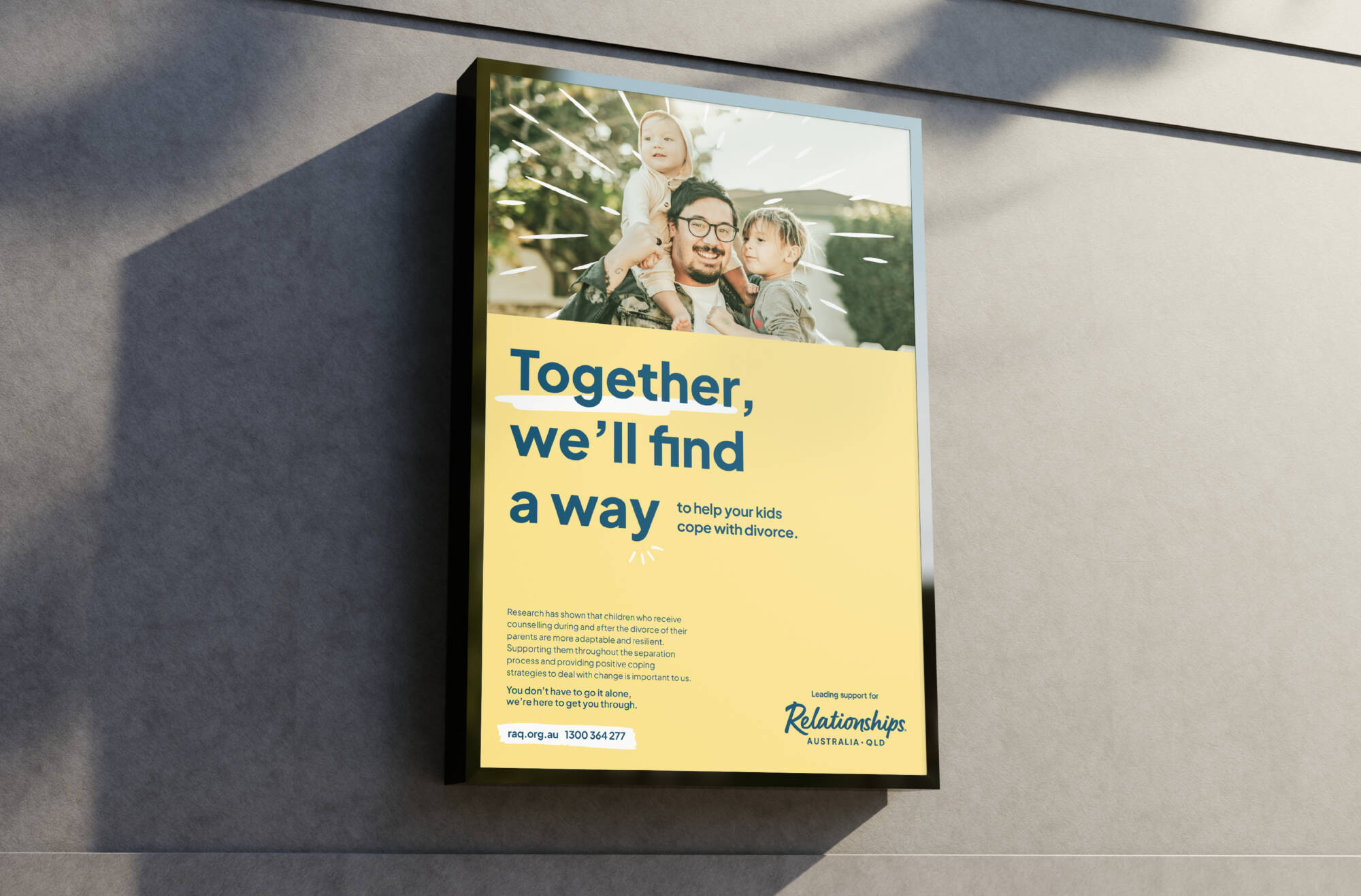
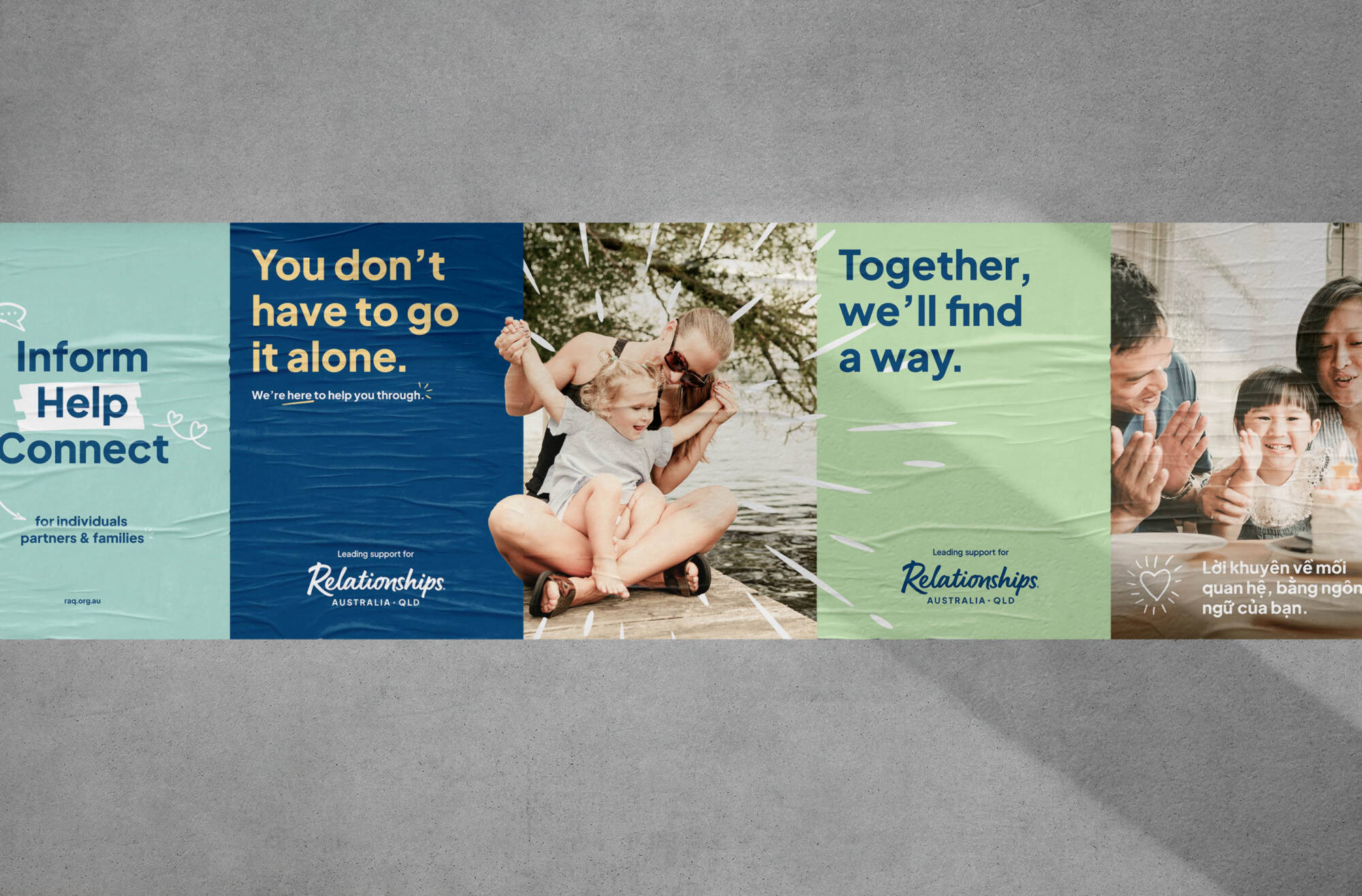
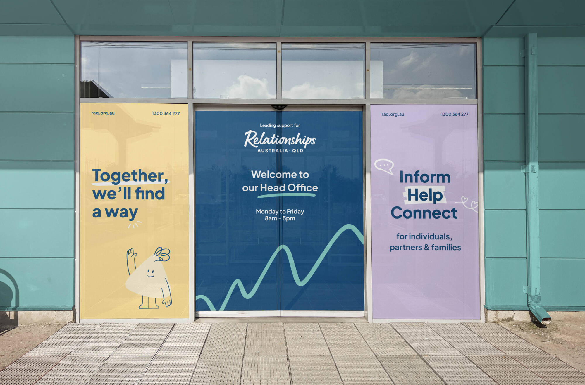
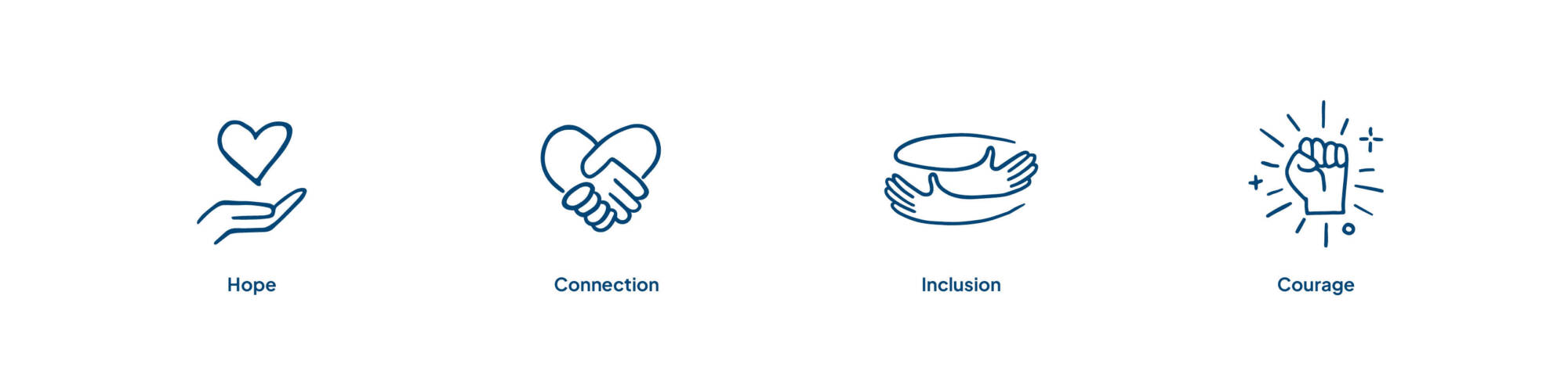
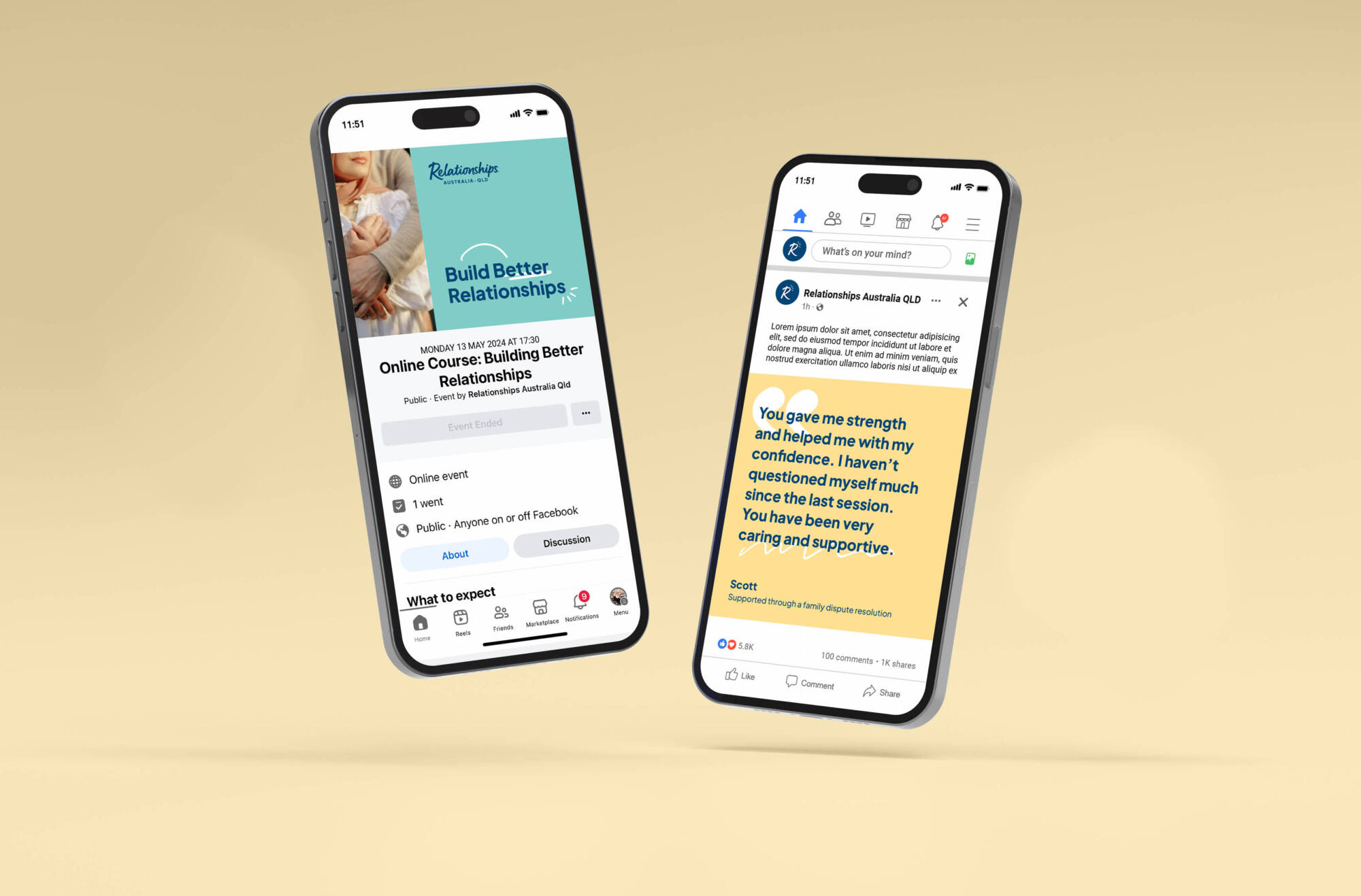
DAIS crafted a strategy to position RAQ as a leader in relationship support. The unifying brand theme Always Hope informed all visual and verbal elements—from a softened logo to a warm photographic palette. A modular brand voice, defined by the theme, ensured consistency across audiences, from clients to policymakers. Utilising this theme, DAIS equipped RAQ with the impact statement ‘Together, we’ll find a way’ which when harnessed in campaigns gives it evergreen usage.
Together, we’ll find a way to help your kids cope with divorce.
Together, we’ll find a way to understand your partners’ gambling problem better.
Together, we’ll find a way out of an abusive relationship.
When combined with client concerns, backed by evidence-based information, and underpinned by a supportive call to action, it invites clients to seek help building deeper social connections.


To enhance engagement, DAIS introduced Sunny, a custom character who interacts with content and typography. Sunny adds warmth and clarity—particularly for sensitive topics such as the Children’s Contact Service—helping to humanise complex information and build emotional connection.
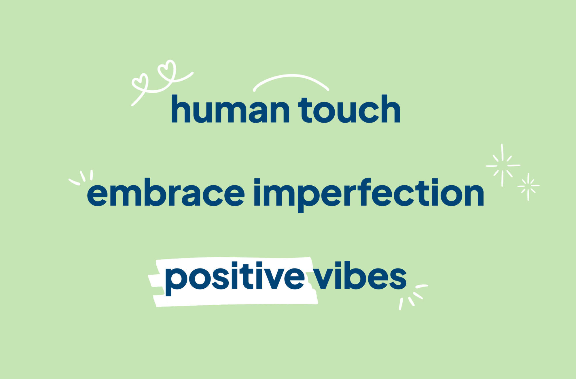
DAIS designed hand-drawn doodles that bring a welcoming, human character to the Relationships Australia brand. Complementing Sunny and the overall aesthetic, these versatile illustrations enhance visual interest, highlight key messages, and can be used over images, around text, or independently to emphasise content and create a cohesive, engaging presence across corporate and marketing materials.
A tailored rollout strategy enabled flexible messaging and inclusive design. A bright, engaging colour palette and adaptable typeface supporting over 200 languages ensured accessibility, while brand tools; from signage to brochures, reflected RAQ’s hopeful vision. DAIS provided detailed guidelines to ensure consistent brand application across all touchpoints.
The palette was designed with versatility at its core; meaning RAQ could adapt it to effectively resonate with a wide range of audiences, depending on the context. Vibrant and playful when engaging with children and youth services and easily dialled back to convey professionalism and credibility for funder or government-facing communications.


The brand’s success in Queensland led to national adoption, realising a unified identity that the board had previously considered out of reach. The transformation improved visibility, strengthened internal alignment, and positioned RAQ for future growth and advocacy.
This project demonstrates how cohesive brand strategy and identity can amplify purpose, unify voice, and drive meaningful connection—especially for mission-driven organisations.