Wynnum Manly Workers Sports Club was outdated, experiencing confusion with another local club and about to begin open plan, modern renovations. The club wanted a unique brand creation to establish a position in their locality and work with the architectural plans.
It was clear a new name was required to reposition and energise the brand, while incorporating their rich history as a cricket club. We took the concept of a field (to be used for play, work or sport) and fielders (people coming from far and wide to be part of a group experience or simply going onto a field to play), and the new name ‘Fielders’ was formed.
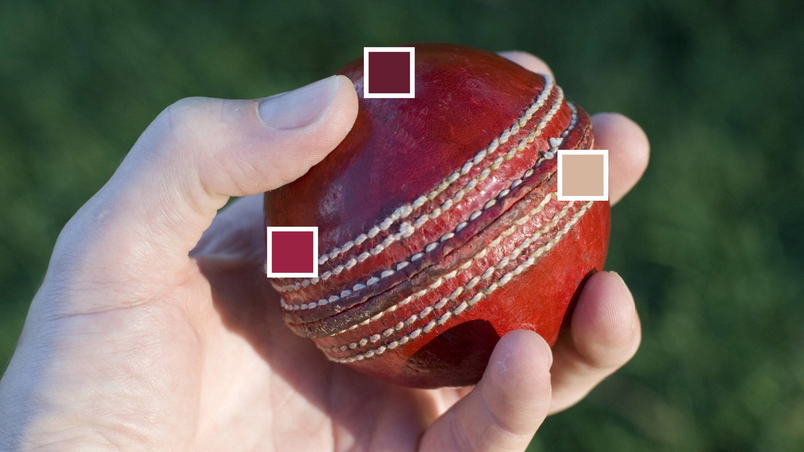
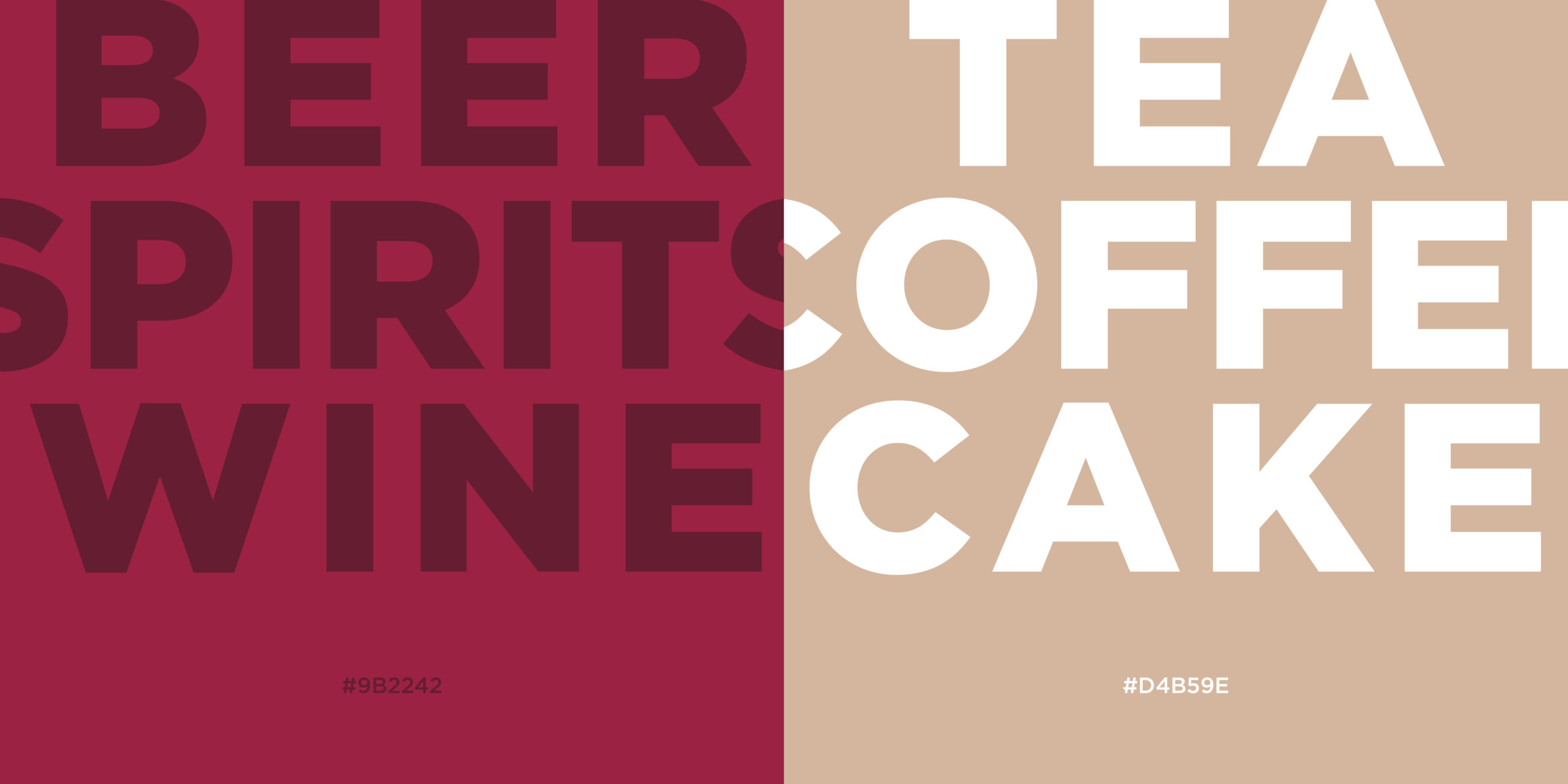
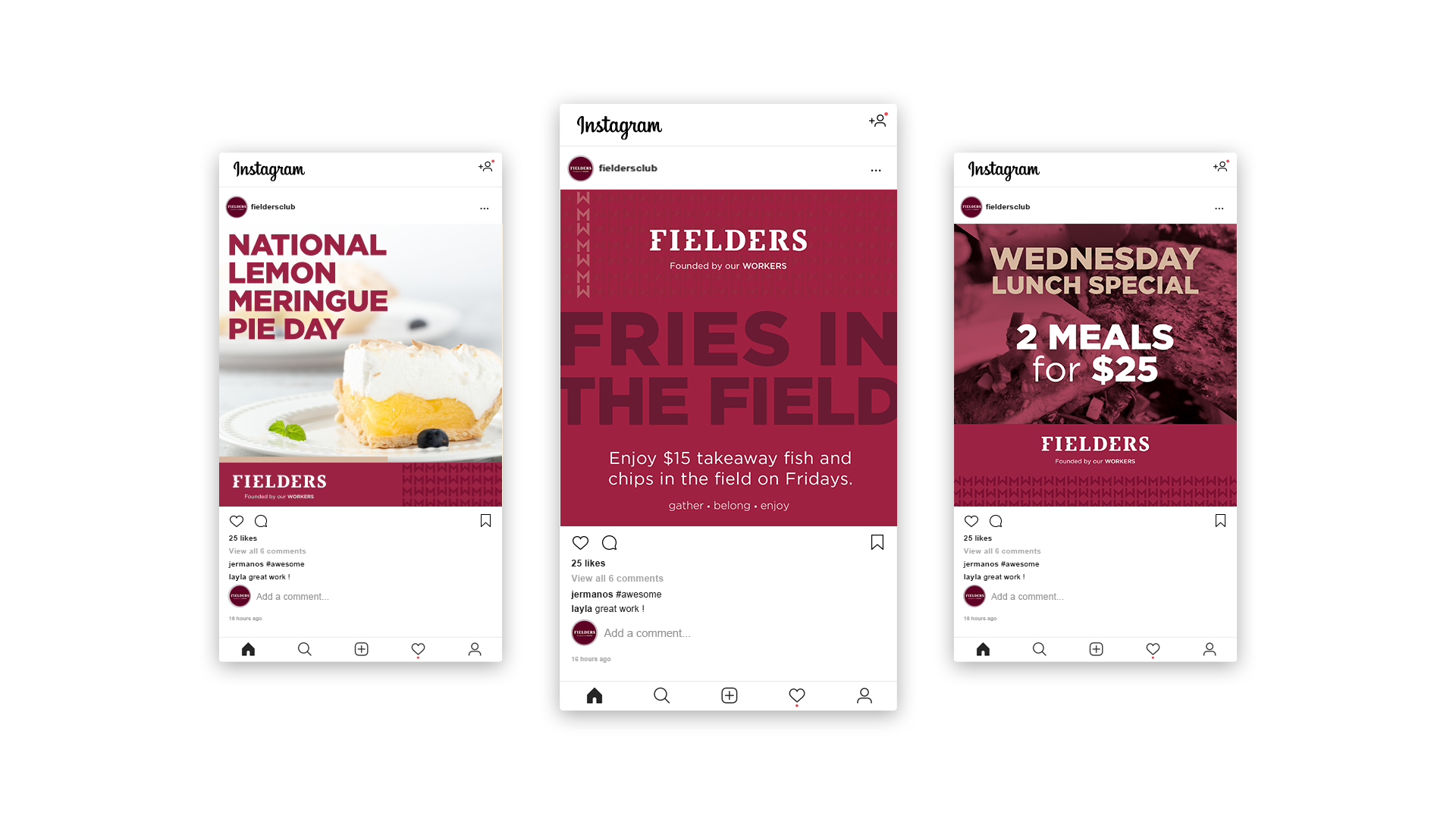
The construction of the Fielders logo and colour palette involved a modern take on heritage colours, strong typographic language and a visual identity pattern inspired by cricket ball stitching.


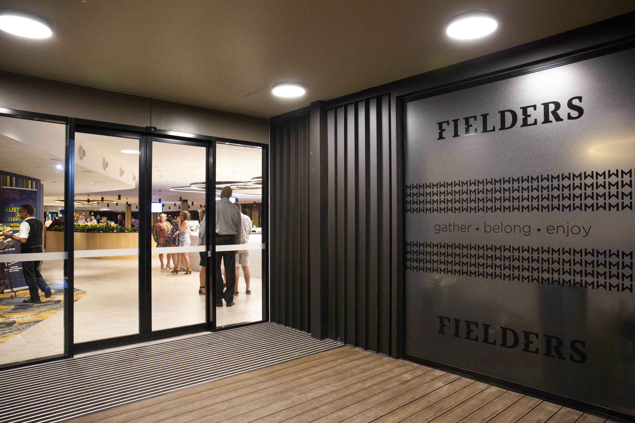
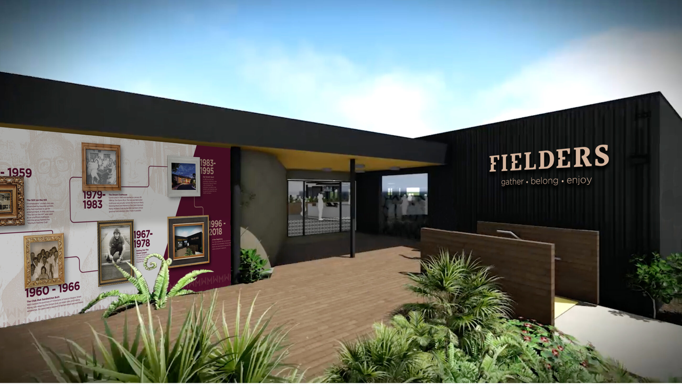
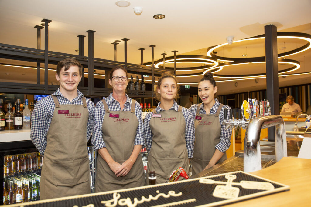
To position Fielders Club as an inclusive, engaging and family-friendly place for all community members, we crafted the brand promise, ‘always welcome’, and solution streams, ‘gather, belong, enjoy’. ‘Founded by our WORKERS’ is the brand credential which acknowledges the club’s beginnings, and to further recognise heritage and encourage connection, we designed a history wall as a strategic feature of the entry of the new building.
The brand identity and campaigns also needed to be modern and exciting to widen the club’s customer base by appealing to a younger, family demographic. The Fries in the Fields event is an opportunity for families and friends to share a picnic lunch at the club and to engage with Fielder’s new brand and club space.
Since launching in early 2019, Fielders has been embraced by the local community, revitalising the club as a place of activities, events and entertainment for all members of the community to enjoy.