Elevating brands
  • Project

Directors Australia

Situation

Directors Australia is an established company that operates across Australia and was looking to undergo a corporate rebrand. Specifically, the business had an outdated brand identity and were experiencing increased market competition. Therefore, we helped develop a corporate rebranding structure to establish market leader positioning and prepare for future growth.

Objectives

  • Evolve the brand identity, while building on existing brand equity,
  • Consolidate positioning across the two parts of the business,
  • Generate brand awareness and interest across potential clients, the industry and candidates,
  • Ensure the brand structure and messaging reflects the current business strategy.
Brand graphic device used as an image frame
Corporate rebrand language and positioning for Directors Australia

Corporate rebrand strategy

We introduced the technical descriptor ‘board performance specialists’ to reposition the brand as a holistic service providing end-to-end board solutions. As well as this, we developed three solution streams ‘Advisory. Governance. Recruitment’ to communicate their unique competitive advantage.
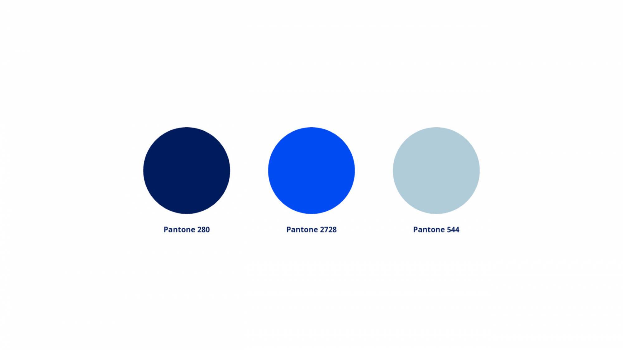
Colour palette for corporate rebrand strategy - navy, cobalt blue, light blue/grey
Design of logomark came from the D and A letters of the corporate identity name - Directors Australia
Directors Australia new corporate logo

Rebrand Design

While retaining the brand name, Directors Australia, we created a dynamic graphic device through stylising the letters ‘DA’. This device was adapted for the refreshed logo, as a visual identity pattern across a suite of collateral and in campaign execution as an image frame and design element. Coupled with a modern colour palette of grey-blue, deep and bright blue, the brand’s new identity is clear, engaging and recognisable.

Brand voice

The brand’s tone of voice combines their passion for change, collaboration and engagement with their authority as recognised and proven experts in the corporate space. Additionally, this messaging appeals to multiple markets, across sectors and industries, and aligns with the business strategy for future growth.
examples of how graphic device can be used as an image frame and remain on brand
Directors Australia brochure design mockup, corporate collateral design
Brand icon is used as visual identity across corporate collateral design and production

Outcomes

Overall, Directors Australia’s evolved identity and structure repositions them as leading specialists in the market with a unique competitive advantage. By positively disrupting the market, Directors Australia is generating brand awareness and recognition and preparing for future expansion.

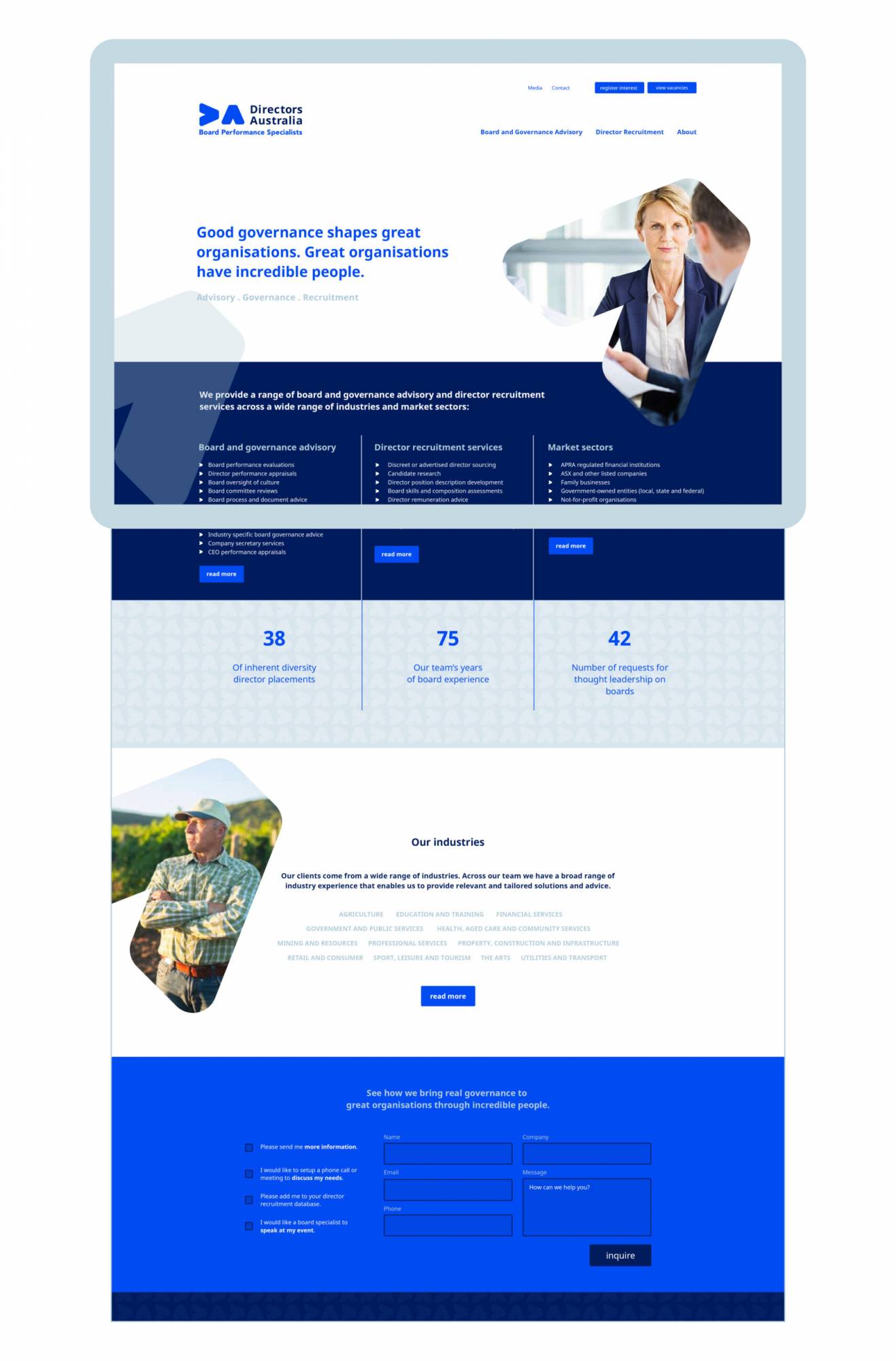
As well as this, we designed a new website that engages with their stakeholder profiles and establishes market positioning, bringing their brand voice and personality to life.

Are you in a competitive market and need a corporate rebrand strategy to elevate your brand? We’re a specialist brand agency in Brisbane with over 30 years experience working with corporate professional services brands. Our team offers expertise in branding, strategy, digital and marketing so get in touch with us to elevate your brand.

Directors Australia - Website example

Similar projects

Actrua - Brand positioning

Actrua

Brand Personality & Voice
Onten - Strategic Recruitment logo- new brand

Onten

Brand Personality & Voice
Click me for a free brand health report!

Step 1 of 11

  • Our brand name is unique in our industry and marketplace.