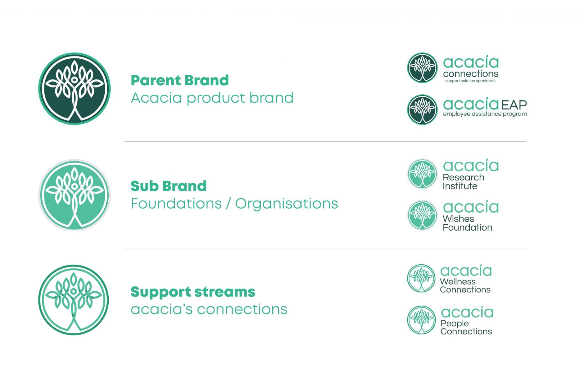
Keeping the Acacia Connections name was key to the strategy to retain existing significant brand equity. We firstly took inspiration from the structures of the Acacia tree in the original logo. Next, we evolved the brand’s identity using interlinking shapes to form a stylised acacia tree. This new icon also represents connections, which is very important for this brand’s identity, culture and language.


