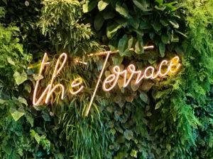
The newly finished Emporium Hotels featured a stunning rooftop bar, The Terrace, that would be showcased as a premium social destination and required a look that would reflect the exquisite essence of Emporium Hotels.


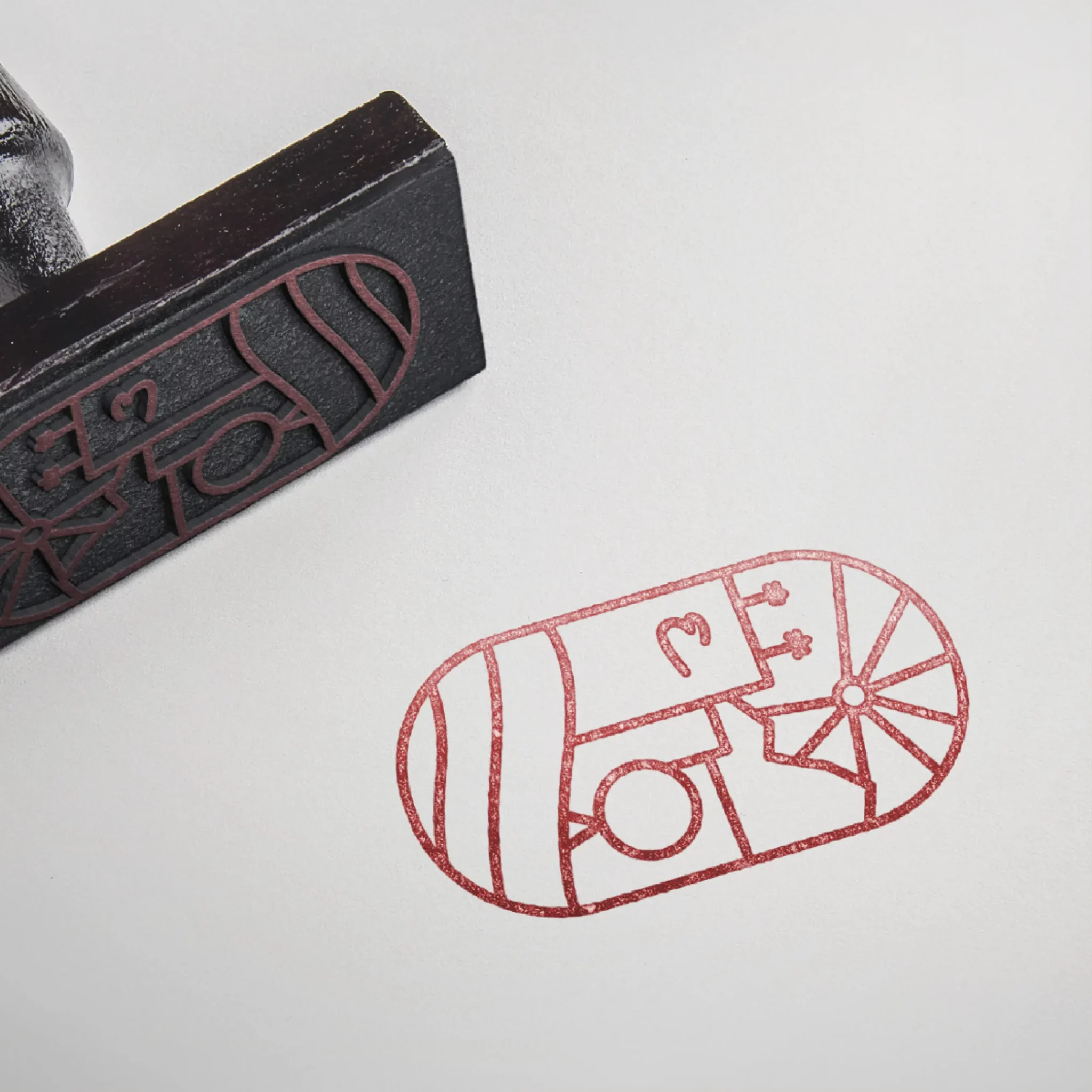
We designed a distinctive identity that shared the hand lettered, angled typeface with the Emporium Hotels wordmark, as well as a custom cartouche depicting the new location nestled amongst the lush green spaces of Brisbane’s South Bank.
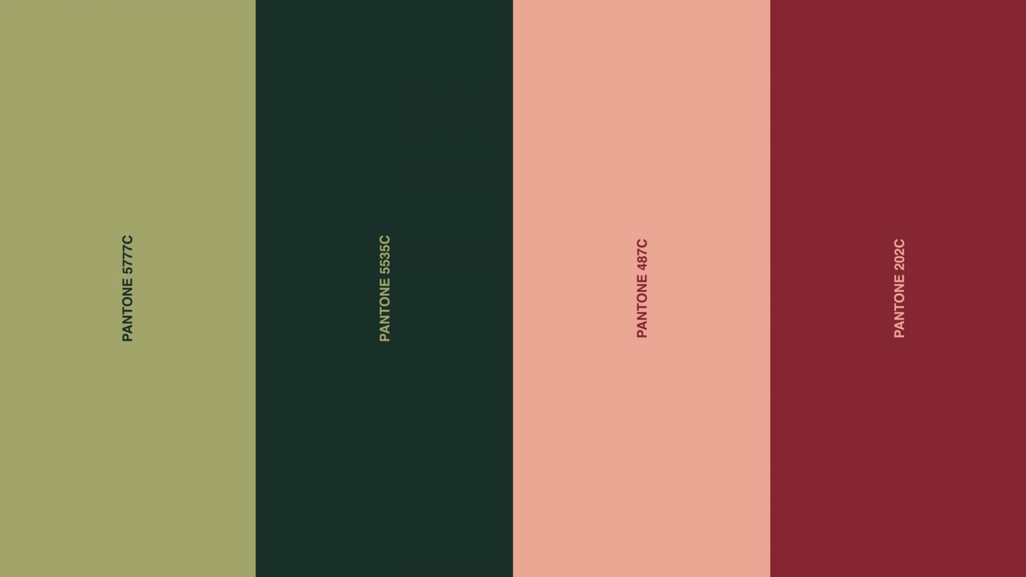
Taking inspiration from lush greenery and the hues of summer sunsets, the brand channels vintage Beverly Hills luxury with a salmon and green colour palette that spans its day to evening offering. Both Helvetica and Inria typefaces are utilised as part of the brand’s collateral to accompany the corporate identity.
"Take your days and nights to new heights"


The Terrace has quickly become an aspirational social venue and was named 2019’s best Boutique Bar at the Queensland Hotels Association Awards, further enhancing the Emporium’s reputation as a leading premium boutique hotel destination.
Do you have an existing business and thinking of creating a new sub-brand? Or need help with your brand expansion and visual identity? We’re experts in branding, strategy, digital and marketing, so connect with us here.