As part of their brand expansion and strategic relocation to the South Bank precinct in Brisbane, Emporium Hotels required a new sub-brand visual identity to be integrated into their hotel campaign for a bar located on the ground-floor of their new build.
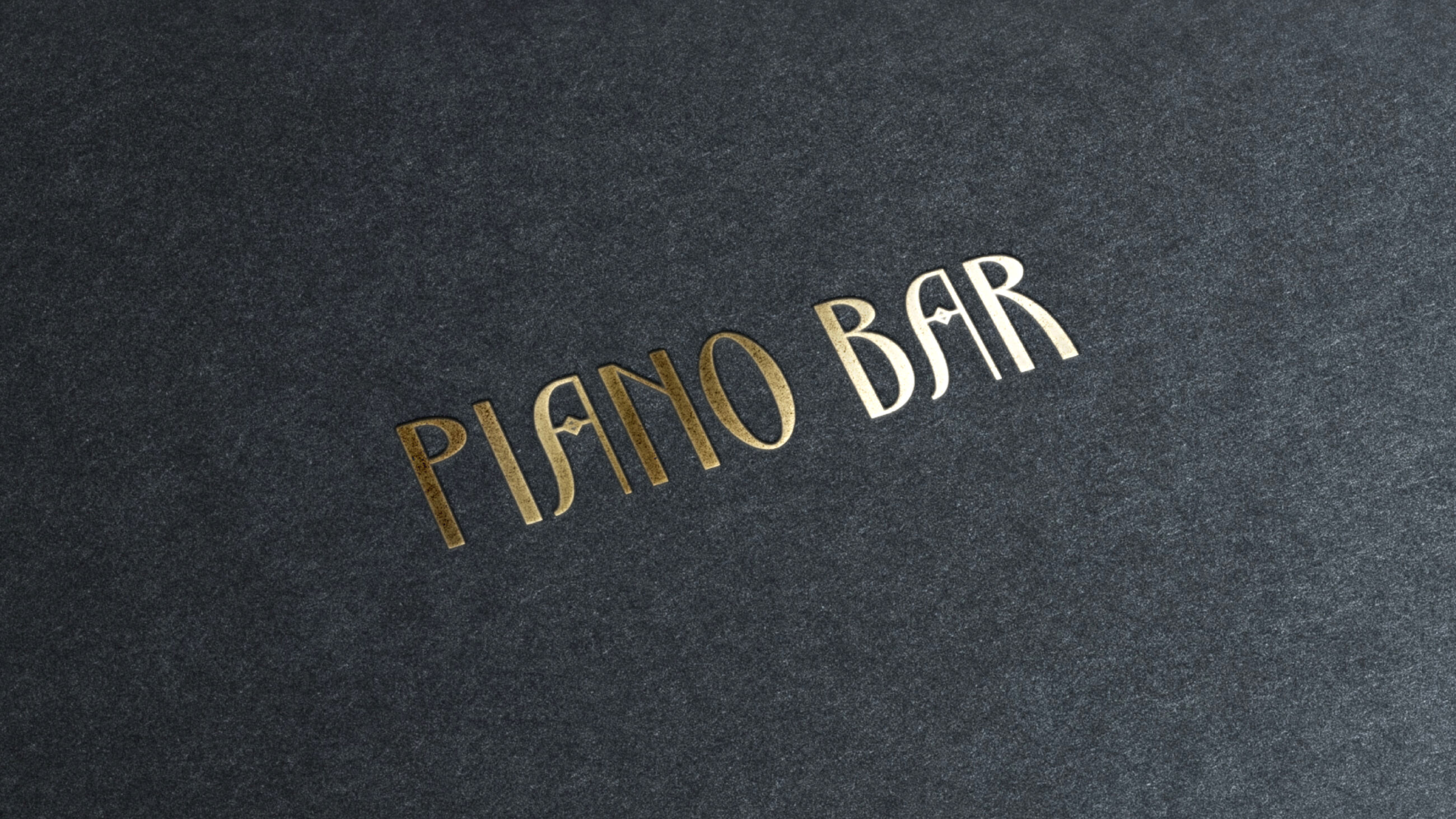
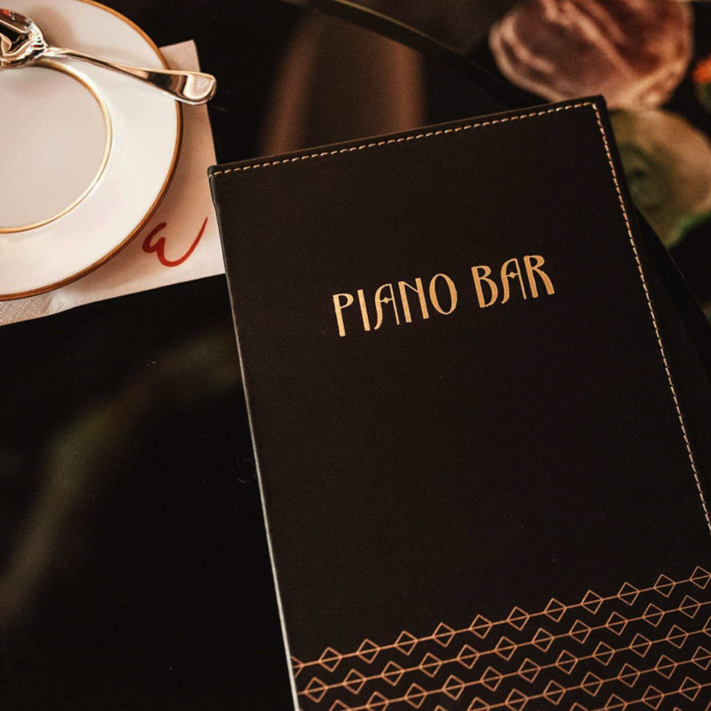
Inspired by the 1920’s Jazz Age, the aptly named ‘Piano Bar’ design was created to exude elegance and sophistication, seamlessly blending with Emporium Hotels’ exquisite theme.
A colour palette of rich blacks and tones of gold enhance the opulence, and when combined with art deco font, Ardeco, creates echoes of olde worlde luxury piano brand typography such as Grotrian and Schimmelalong.
To further connect the typography to the brand’s musical foundation, a nod to notes on the music staff was built into the ‘A’ crossbars in the mark, as well as being utilised as a graphic identity style across the brand.
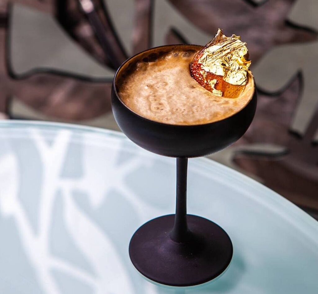
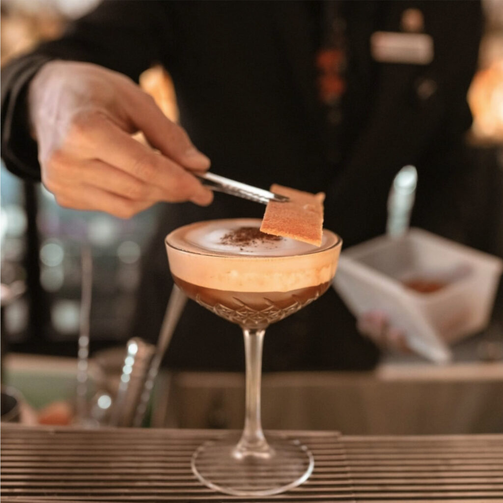
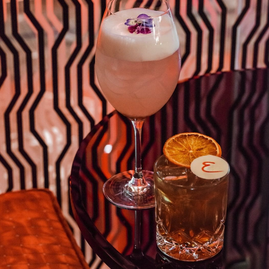
The unrivalled elegance of the ‘Piano Bar’ has encapsulated the sophisticated wining and dining location that was envisioned throughout its planning phase and contributed to Emporium Hotels strong status as an award-winning boutique hotel destination.
