Elevating brands
  • Project

Port of Townsville

Port of Townsville - Old historic photograph

Situation

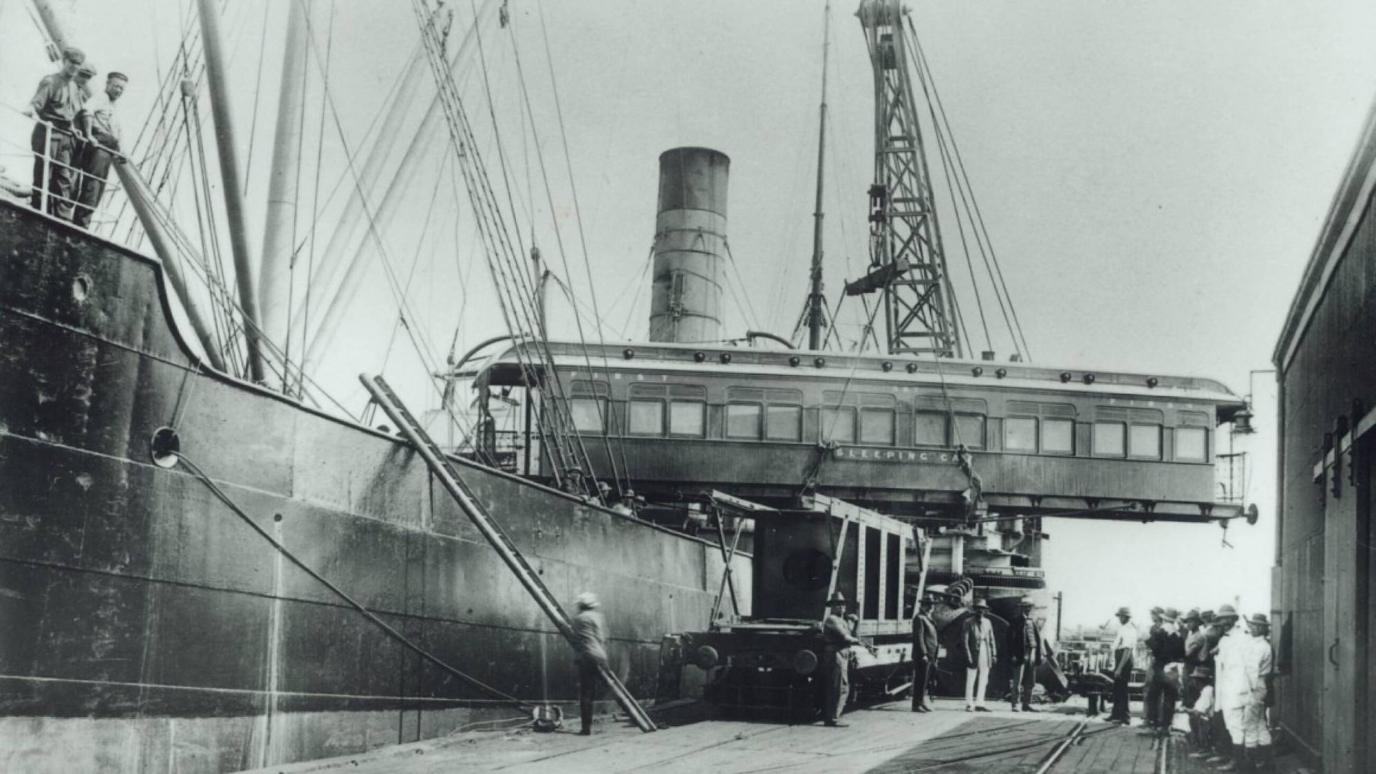
Port of Townsville is an established organisation with existing brand equity however, lacked brand structures to communicate their value to different markets and stakeholders. The brand required an evolution to reposition them as a trusted leader in the community across trade, the environment and the economy, and engage internal and external stakeholders.
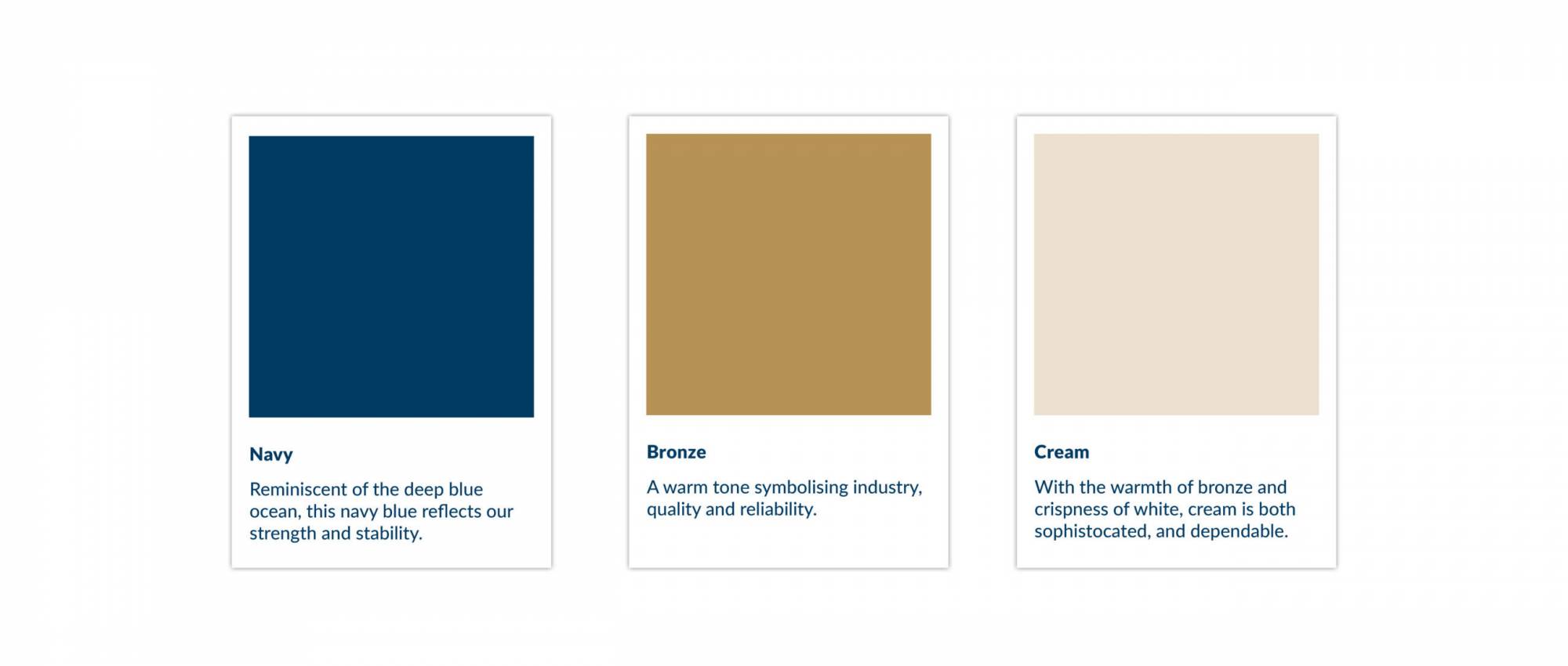
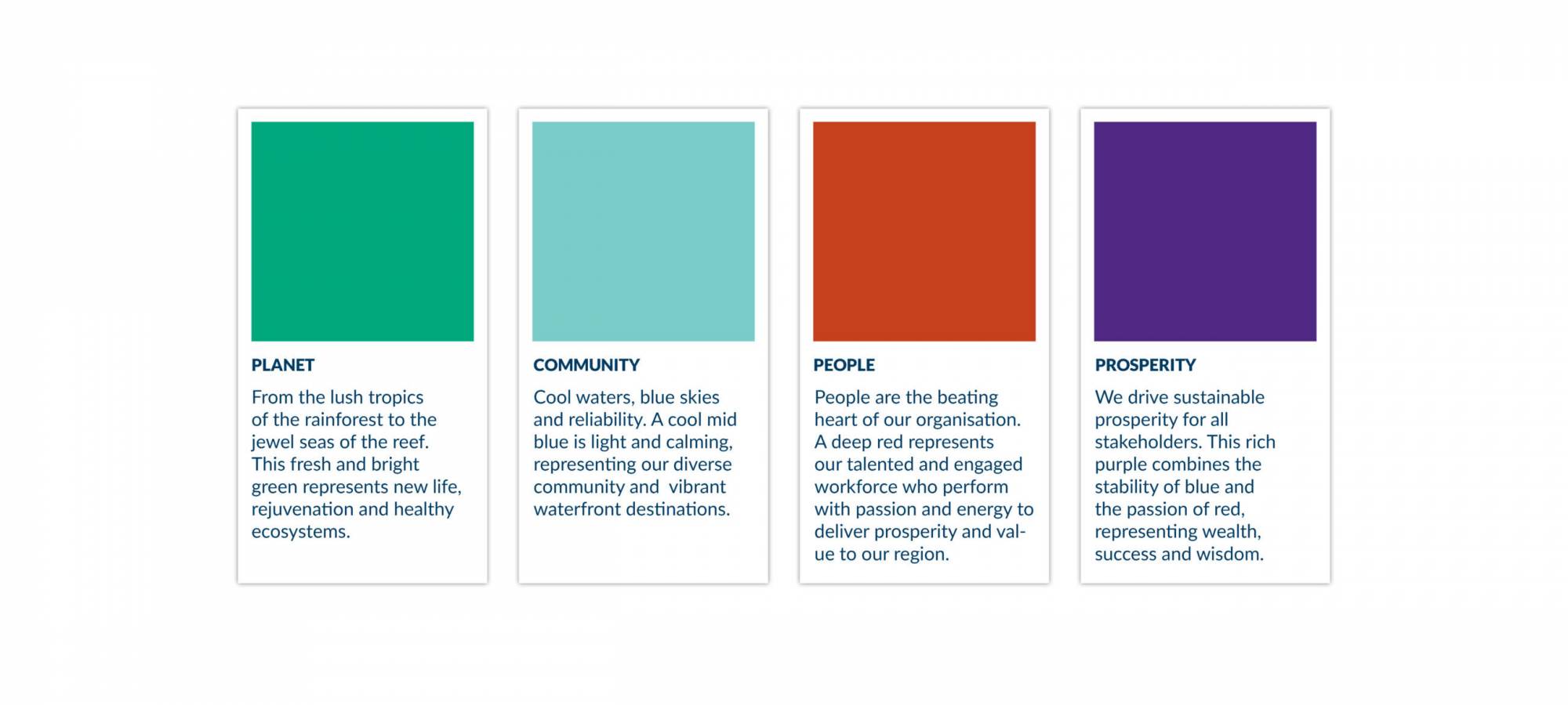
Objectives

  • Refresh and strengthen brand identity and proposition to reflect the connectivity and momentum of the Port and its initiatives.
  • Reframe how stakeholders and community see the Port, building social licence to operate and creating awareness that the Port is more than a trade hub.
  • Evolve and define brand voice to enhance communication and stakeholder engagement
Port of Townsville - delivering sustainable prosperity, stakeholder engagement

Stakeholder Engagement Strategy

After extensive stakeholder engagement, it was clear Port of Townsville required a strategy to reposition the brand as community and environmentally focused. The new brand promise delivering sustainable prosperity communicates this new focus and value proposition as well as the brand’s goal to achieve world-leading sustainable operations.
Port of Townsville Logo
To strengthen the brand’s evolved identity, a new set of ethics were implemented to build an aligning organisational culture – connected, sustainable and prosperity. These ethics foster a benchmark and culture within the organisation to establish an aligned reputation from customers and external stakeholders.
Port of Townsville- Community, Happy lady, stakeholder engagement
Port of Townsville - community and stakeholder engagement strategy
Port of Townsville, community,
Port of Townsville - stakeholder engagement strategy, photograp h and text
Port of Townsville - stakeholder engagement strategy, photograph and text
To simplify the brand’s identity, build upon the existing mark and provide clear company value levers, four priority areas were identified – planet, community, people, prosperity. The brand’s visual identity was strategically evolved to communicate the priority areas through a four-blade stylised propeller that also operates as a story device for teams to easily communicate the brand’s strategy. This icon also symbolises a nexus, indicating the port as a centre for import and export of products for North Queensland with the converging lines and colours reflecting the meeting of land and sea.
With a strong primary colour palette of navy, bronze and cream the brand introduced a rich secondary colour palette to represent each priority area and provide structure for internal and external communication pieces.
Port of Townsville - Branding example
An aligning image palette was introduced to strengthen the brand’s personality and communication. Immense and large-scale imagery were combined with detailed imagery of marine life and textures to depict the scale of the brand’s operations and the connectivity to the community and environment.
Port of Townsville - Case study
Port of Townsville, group of people talking and communicating, showcasing stakeholder engagement
Port of Townsville - Case study

Outcomes

Implementation of the evolved brand identity and structures resulted in a clear and engaging brand voice and an aligned and focussed organisational culture. Internal and external shareholders now have an activated understanding of the brand and their value propositions, driving awareness of new brand repositioning.
Do you need to change your brand voice to enhance communication and stakeholder engagement? We’re experts in branding, strategy, digital and marketing, connect with us here.
Port of Townsville - Business cards on white background
Port of Townsville - Branding example, booklet on white background
Click me for a free brand health report!

Step 1 of 11

  • Our brand name is unique in our industry and marketplace.