Working in extreme environments, GCOM were experts in high-rise building facades, delivering solutions to vertical landscapes focusing on safety, structural, and aesthetic integrity.
This pioneering Australian high-rise building maintenance company needed a brand strategy to position them as high as their ambitions.
DAIS facilitated a brand evolution process, ensuring they achieved their overarching strategic business objectives. This included defining a distinctive brand strategy and a scalable, globally relevant Employee Value Proposition to support national and international growth.
Through workshops, robust conversations with business leaders, a comprehensive brand audit, and market analysis, DAIS identified and articulated what sets GCOM apart from the competition to develop a brand and communication style that clearly articulated its strengths and aligned with its existing and new market opportunities and aspirations.
Led in this new expansive brand direction, DAIS created a brand that speaks with the absolute confidence and certainty of being an industry expert and innovator.
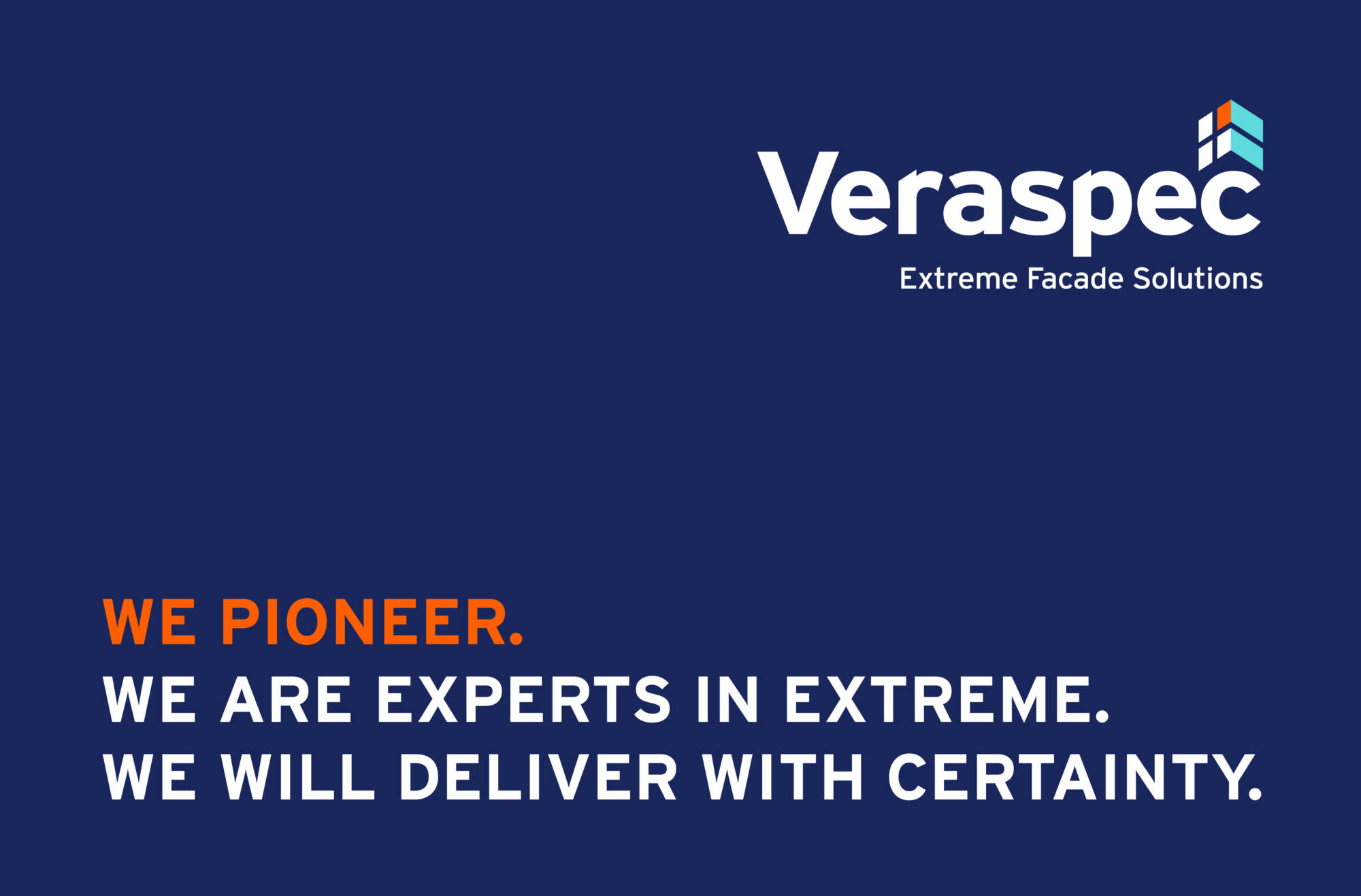
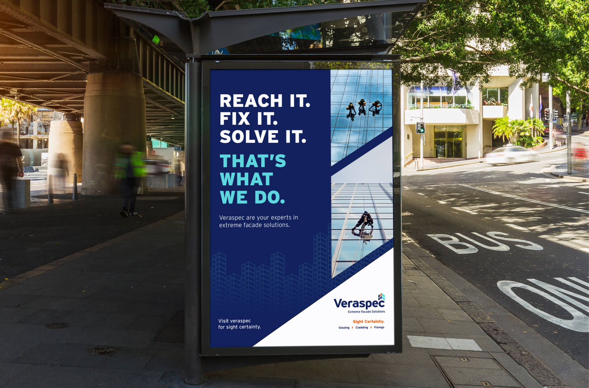
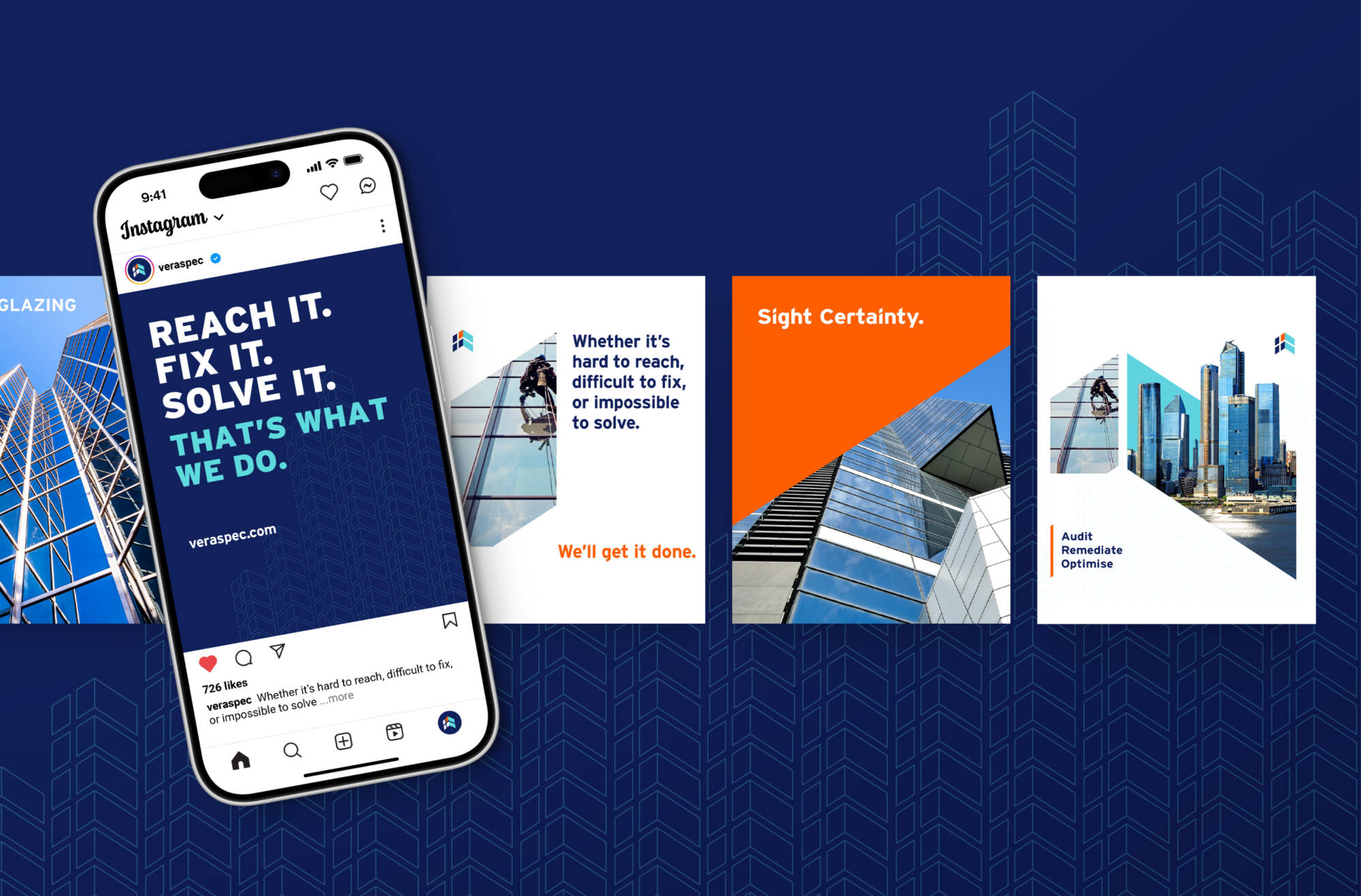
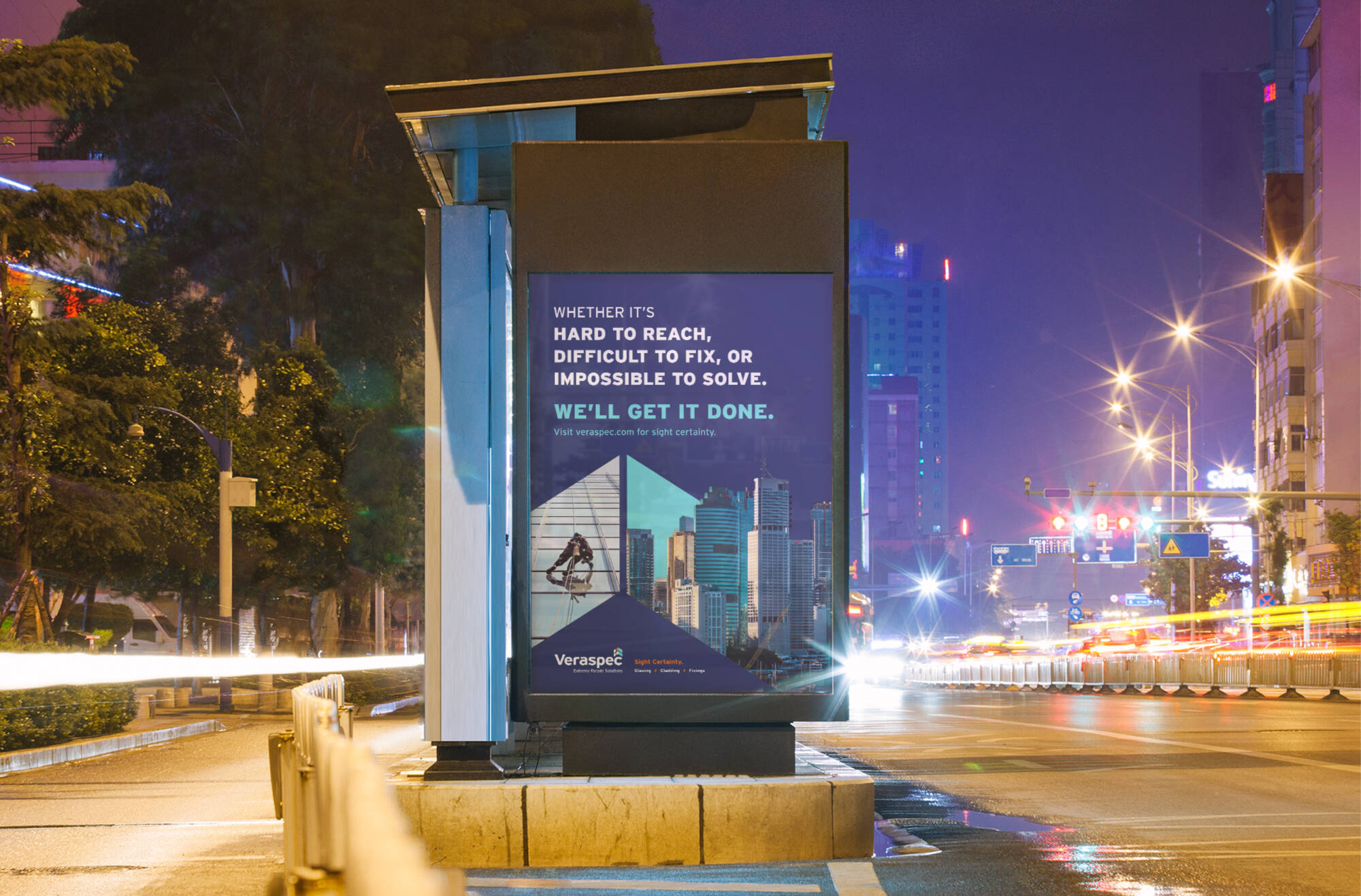
GCOM’s scope was far beyond being world-class glaziers—they are innovators in their space, crafting solutions using in-house developed propriety tools, techniques and next generation technologies. They needed a strong brand identity that articulated this truth. These truths are celebrated as the key messaging pillars: Pioneer, Extreme, and Certainty.
We created a communication architecture that positions the brand with the right stature for the future as a highly professional and efficient solution provider for remedial work on large building facades.
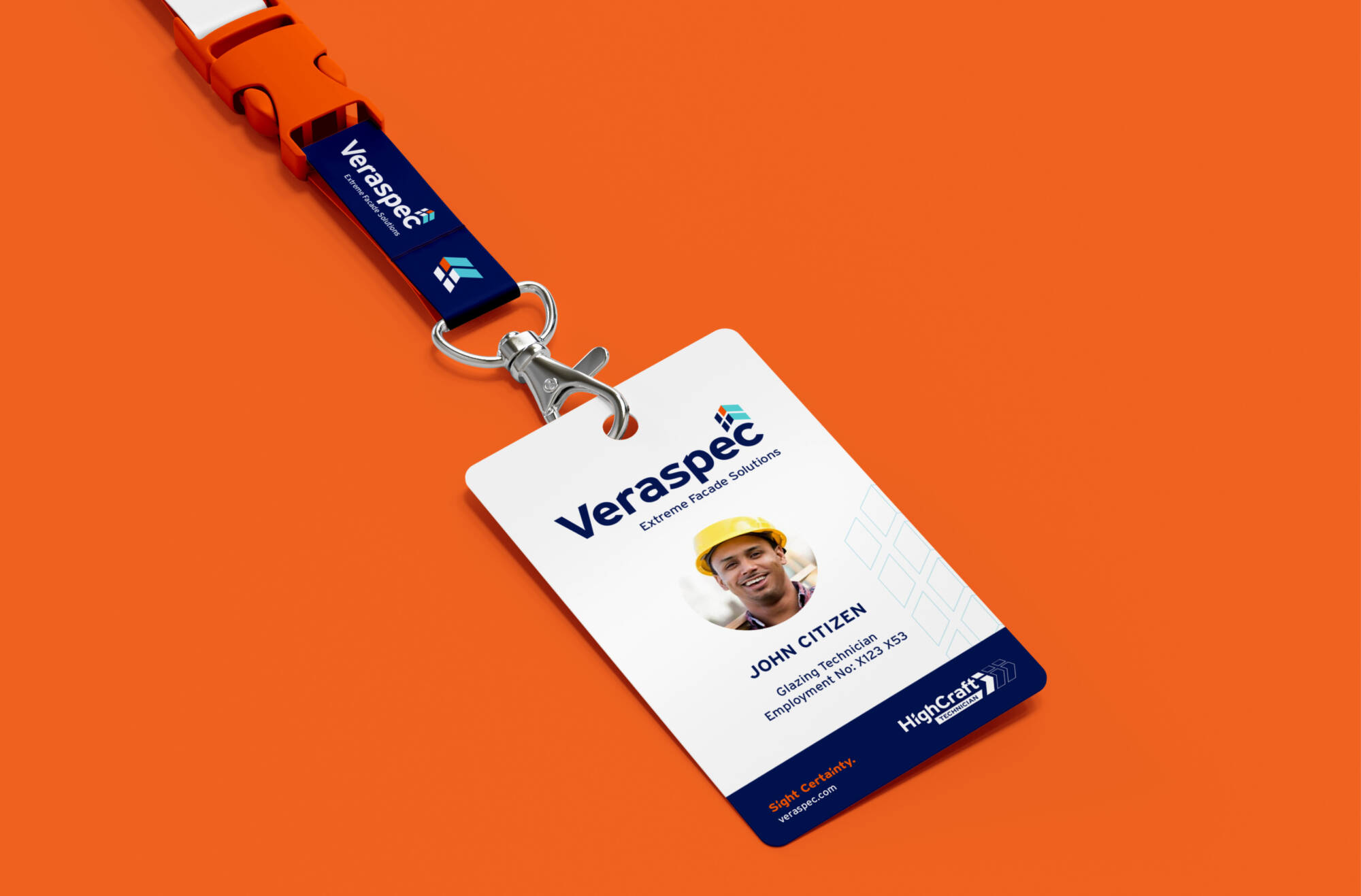
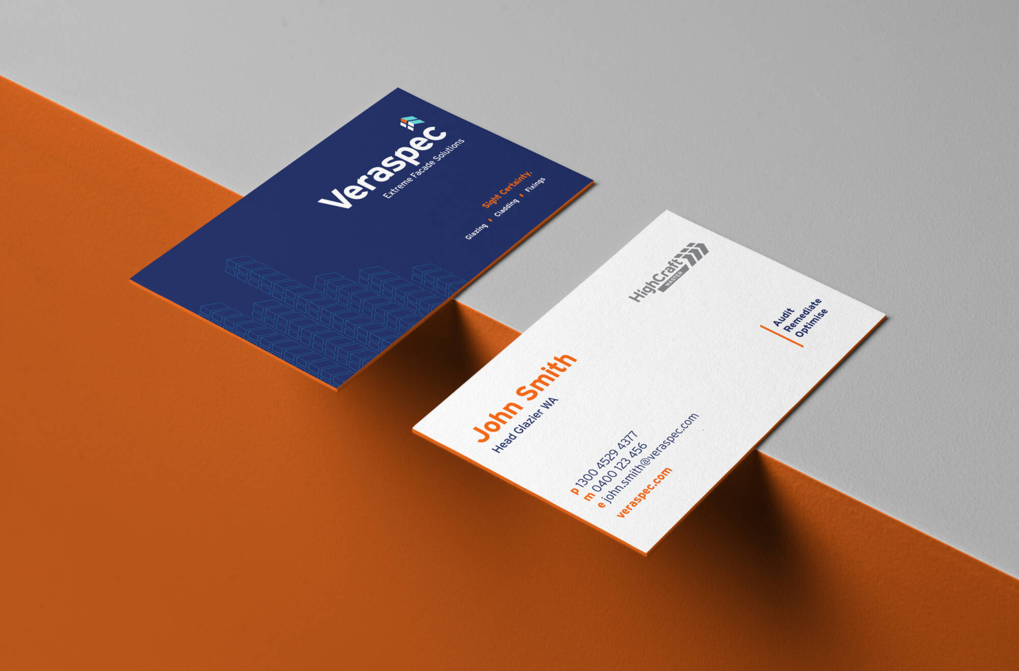
By clarifying the areas in which the organisation was the most capable—glazing, Cladding, and Fixings—they can open greater solution gateways, and offer these services with their new brand promise: Sight Certainty.
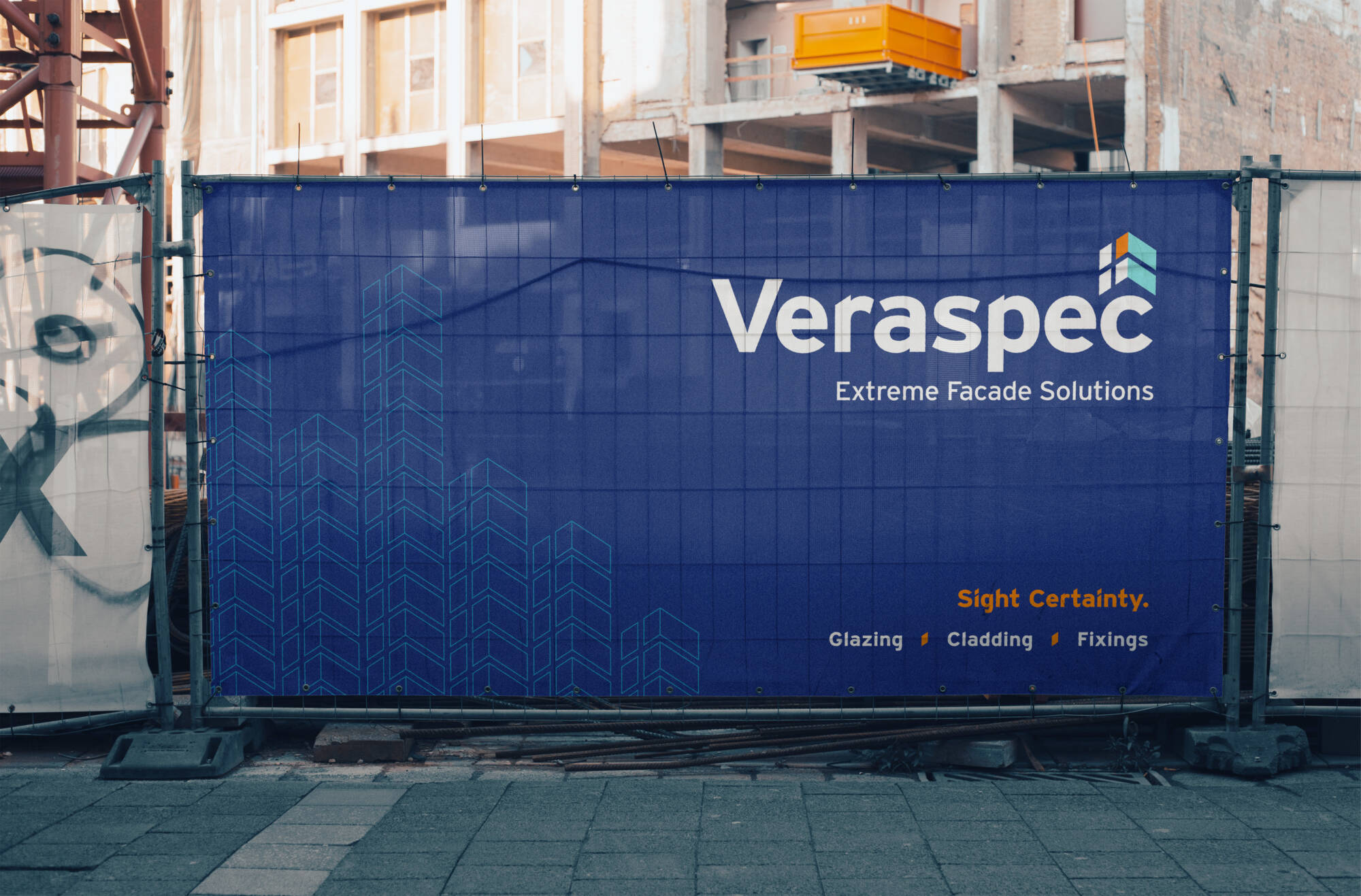
The name Veraspec was born out of the company’s strong foundation of experience and industry reputation in all aspects of extreme, vertical landscapes.
It was crafted to not only be easily articulated by varying stakeholder profiles but also position Veraspec as demanding respect through the considered combination of the words Verify + Specify, Vertical + Aspect, Veritas + Specialists. Working on levels and layers that chime mental associations with strong, positive, industry specific language so that whatever angle you look at it, Veraspec are a brand to look up to.
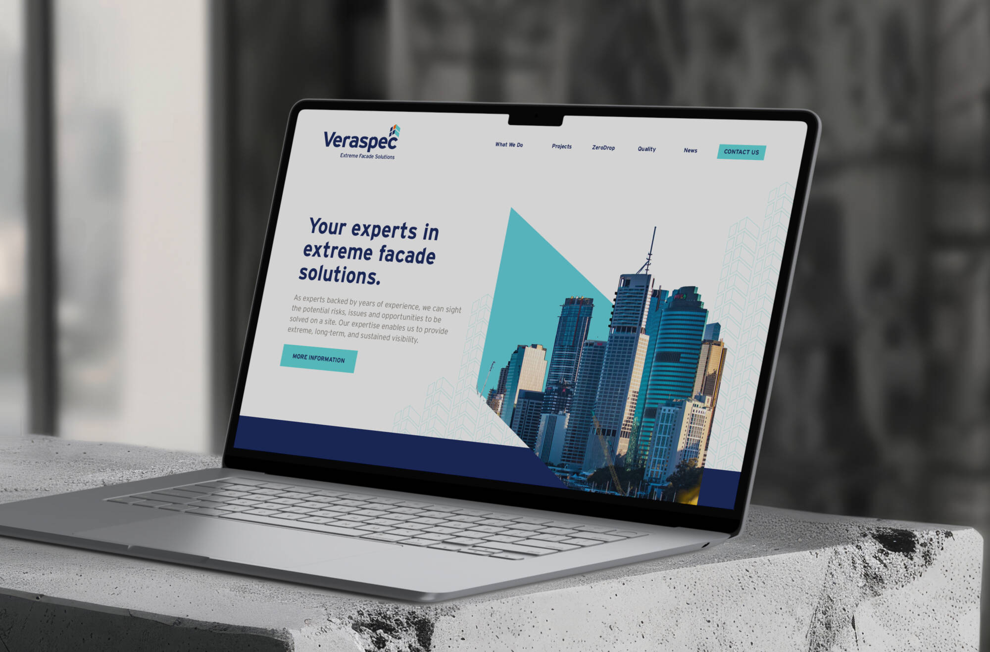
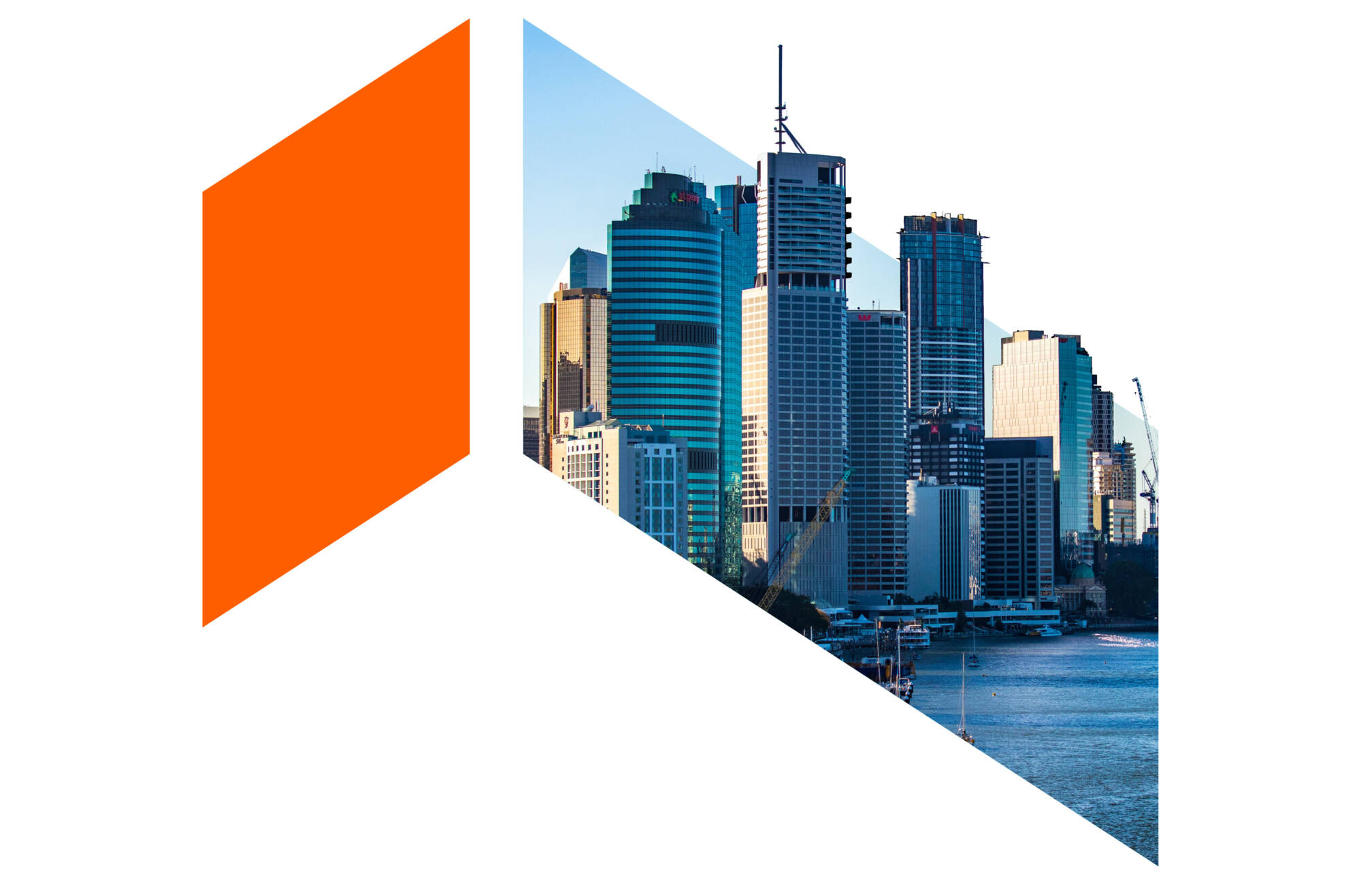
Veraspec needed a visual identity that was highly impactful. We created graphic elements that reflect the unique environment they operate in. Sharp angles symbolise the stunning high-rise buildings, complemented by bold typefaces, vibrant colours, and a certification system that they can own. This system provides a credentialed performance methodology, giving their clients peace of mind and showcasing Veraspec’s quality of work and expertise. The brand is designed to be highly visible, aiming to be recognised throughout Australia and beyond, in partnership with their international brand, Audomas.