Organisation Dynamics needed a brand refresh to embody its unique approach and propel it to a more elevated niche within an ultra-competitive market. We discovered their empowering style of “coaching from the sidelines,” which created high-performance team synergy that transcended conventional consultancy and facilitated organisations’ overcoming complex, dynamic environments to achieve success as cohesive, productive collaborators.


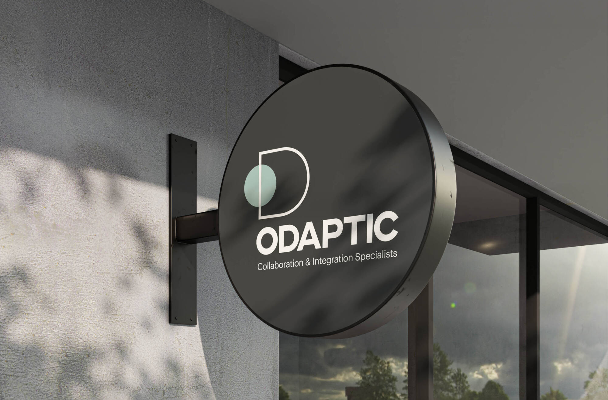
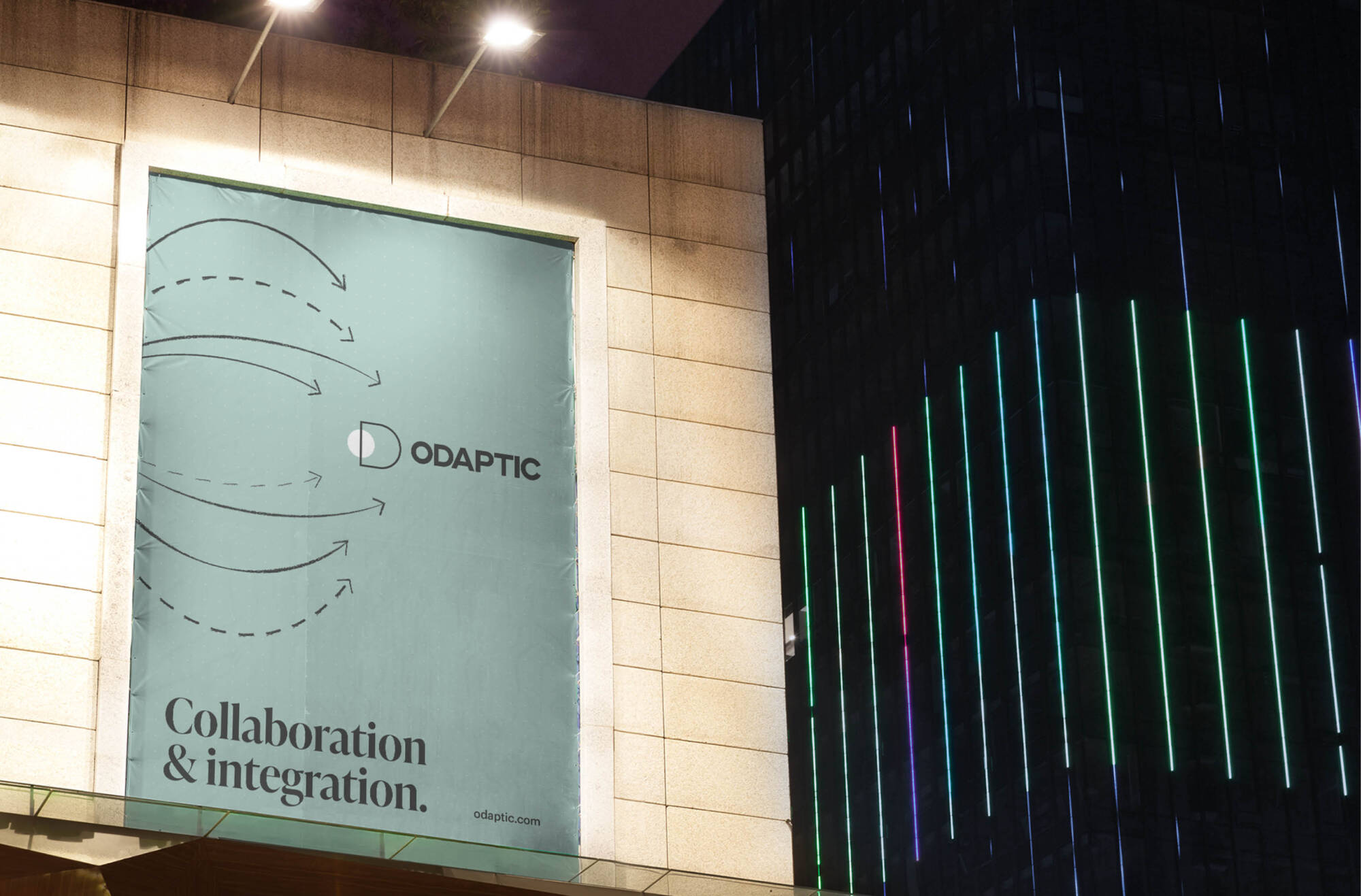
Working closely with the leadership team, DAIS conducted extensive workshops, brand audits and analysis of the competitor landscape and identified an opportunity to leverage the founders’ unique approach as their differential advantage. DAIS distilled this approach into an impactful new name, ODAPTIC, that compellingly articulates the team’s processes to internal and external stakeholders and boldly repositions the company as Australia’s leading collaboration and integration specialists.


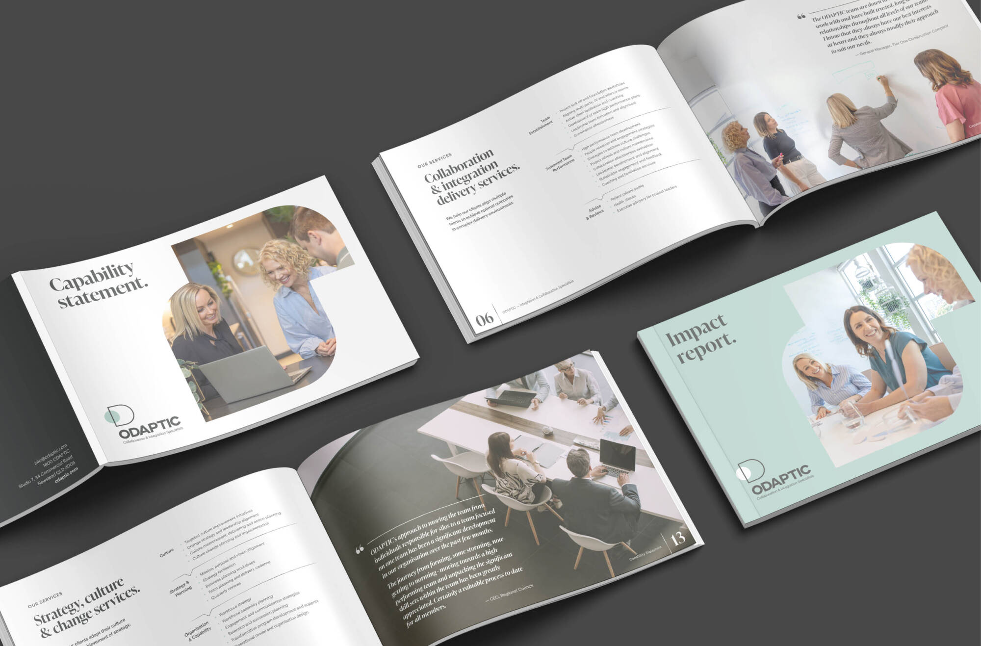
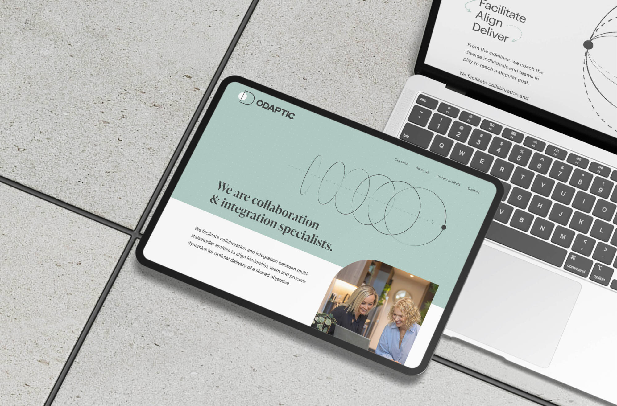
The technical description of Collaboration and Integration Specialists positions the company as more than stock-standard consultants but pioneers of a unique, human-centered approach to solving complex workplace dynamics. The ODAPTIC Approach defines and distills this approach into a comprehensive visual system made it scalable, replaceable, and teachable, helping team members achieve more efficient client engagement.
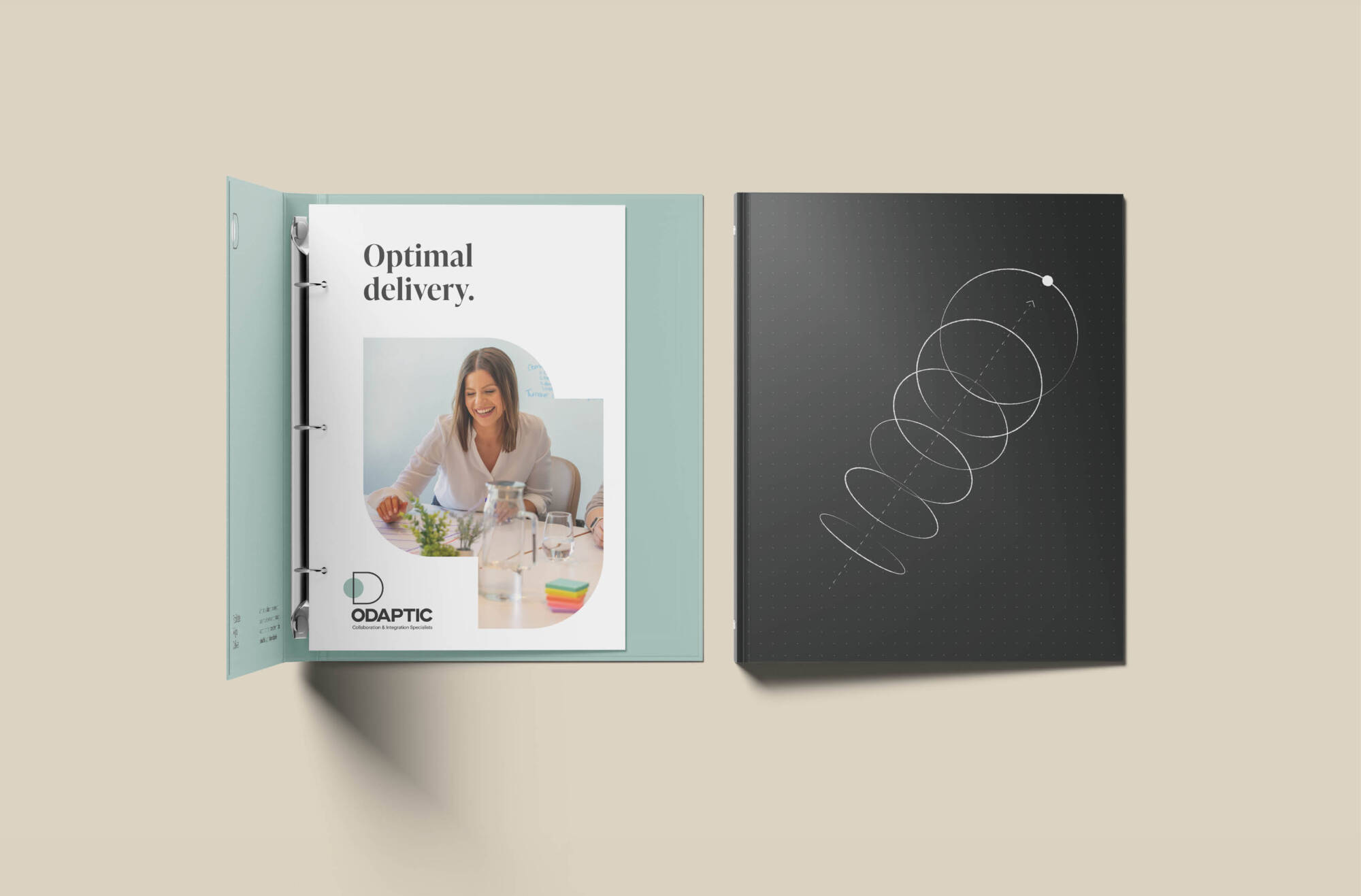
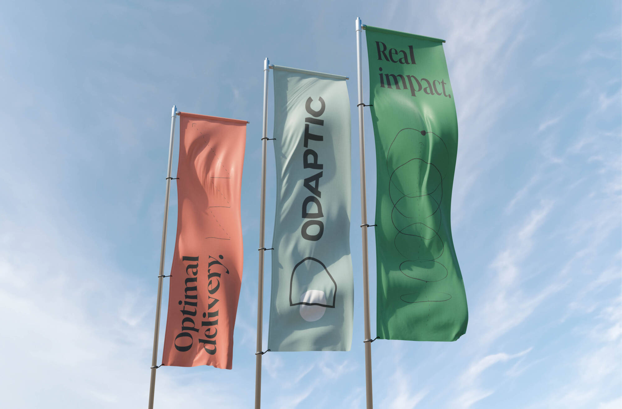
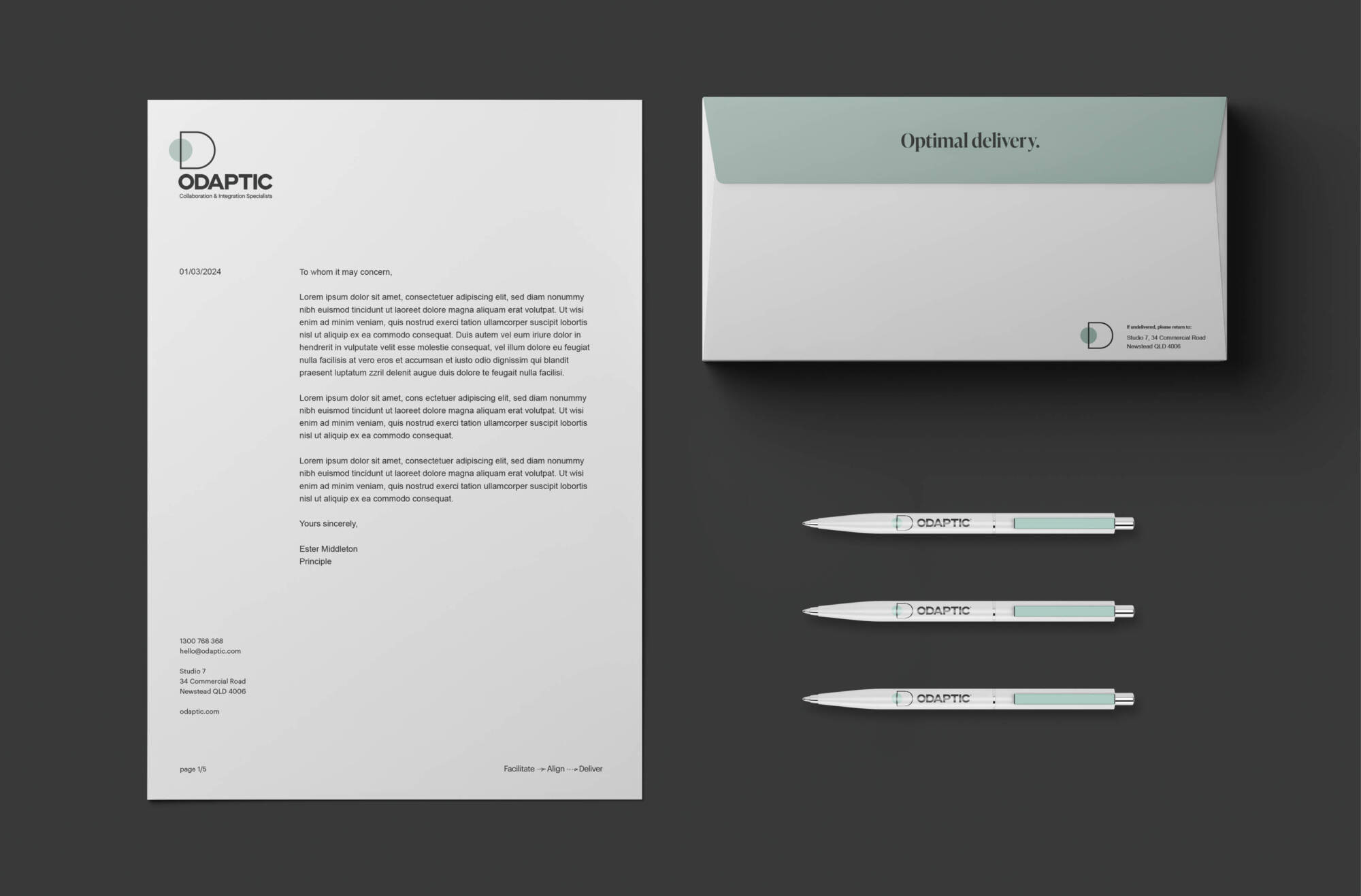
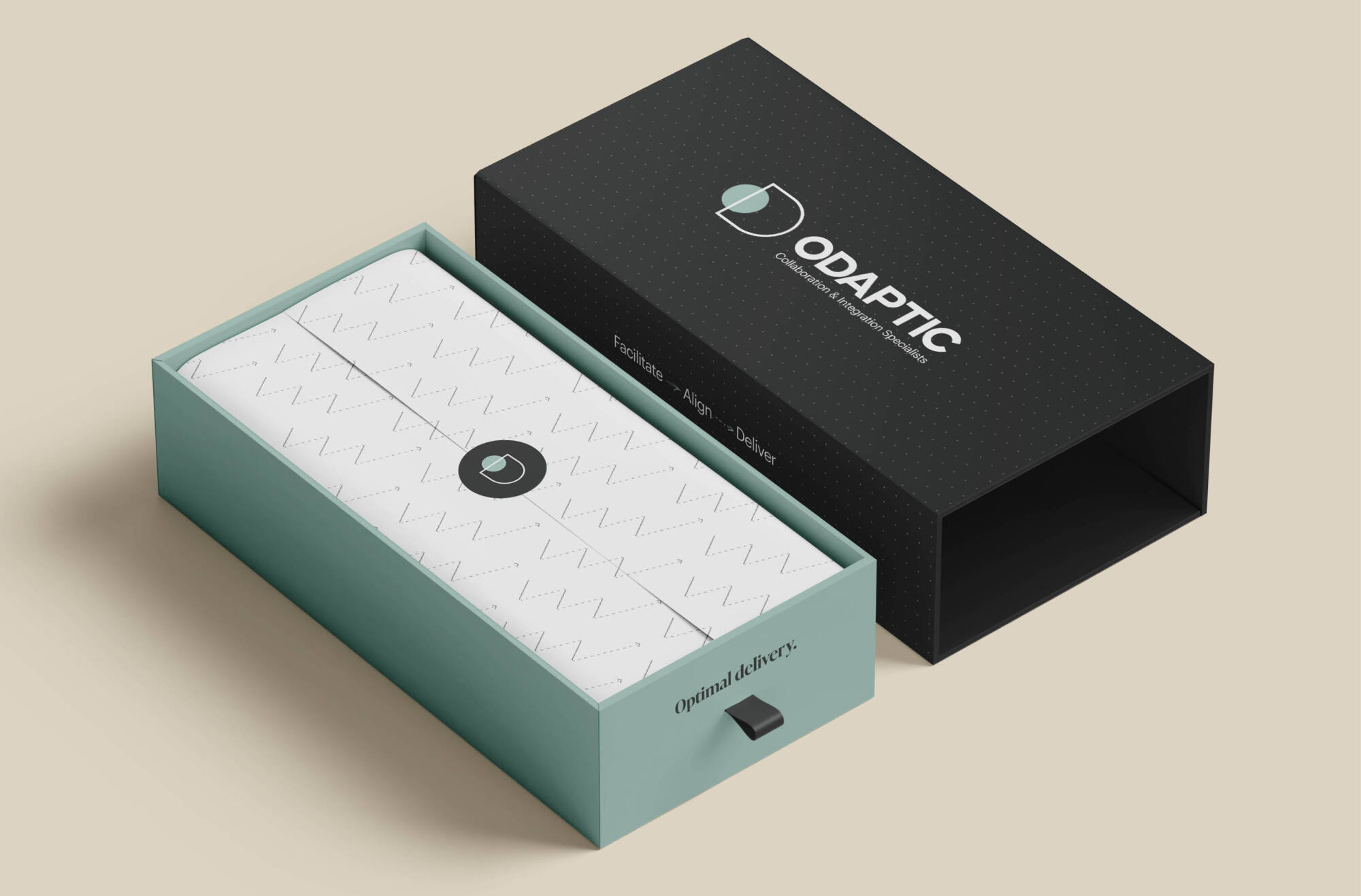
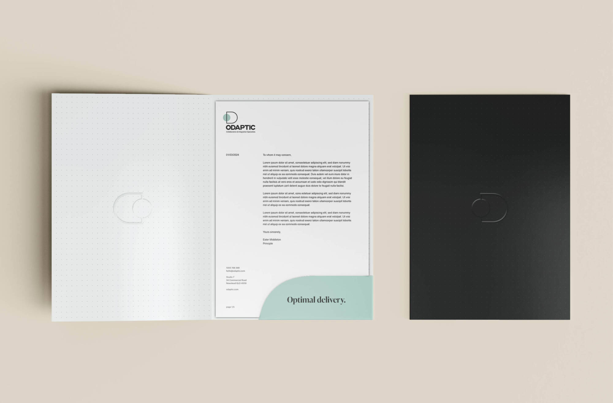
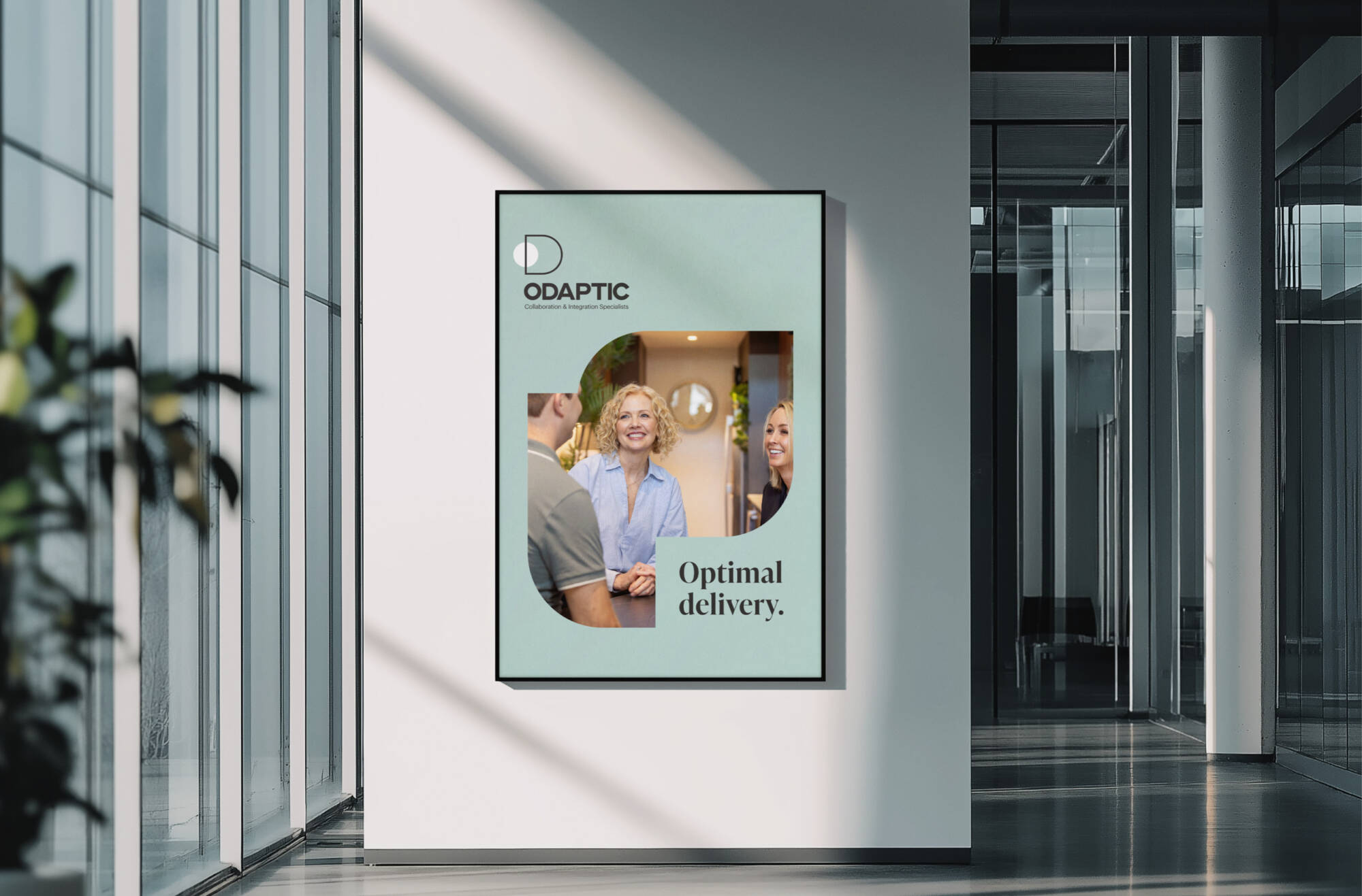
The brand promise, Optimal Delivery, was established as the goal of the Approach, offering a quantifiable standard of performance for the team to measure against: have we facilitated collaboration and integration, and aligned leadership, teams and processes to deliver tangible results?
The bold new visual identity includes distinctive, sketch-style illustrations inspired by their way of “coaching from the sidelines.” The bold, powerful wordmark reflects the gravitas of the organisation’s influence, accompanied by fresh, new collateral and assets with a bold new colour palette. The new visual identity brings consistency to all touch-points and establishes an authentic synergy between the brand and its promise of aligning complexity and delivering impact.