Elevating brands
  • Project

Hillhouse

Situation

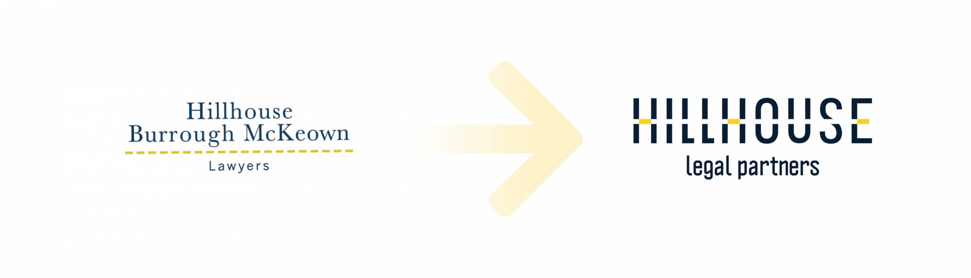
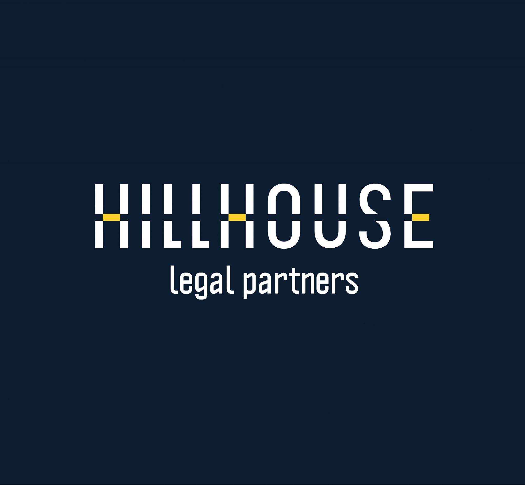
An established law firm that had a traditional partnership brand using partner names, required a brand evolution to reinvigorate their brand for future growth, as well as reflect their heritage and history. The business also lacked brand consistency with multiple versions of their identity being used across website and corporate collateral. The rebrand was in line with the implementation of their succession plan with the objective of clearly communicating their unique difference in the legal industry.

Objective

  1. Reinvigorate brand and positioning strategy to honour legal heritage and reflect current business momentum.
  2. Develop brand strategy to future proof and allow for growth and expansion with a brand name that has meaning and creates culture.
  3. Create scripting around their brand to ensure the entire organisation consistently engages stakeholders in the same way that is ‘on brand’.
  4. Reposition brand as innovative market leaders with a commercial edge.
  5. Craft a strong visual identity that could be rolled out across all aspects of the business.
before vs after brand positioning strategy developed by Brisbane brand agency DAIS

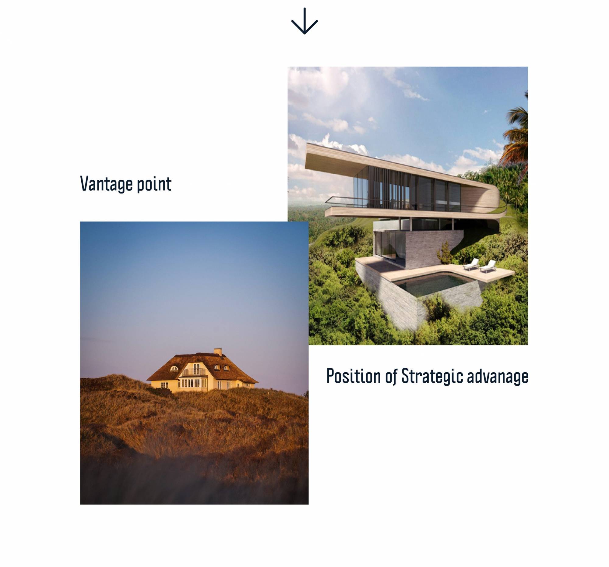
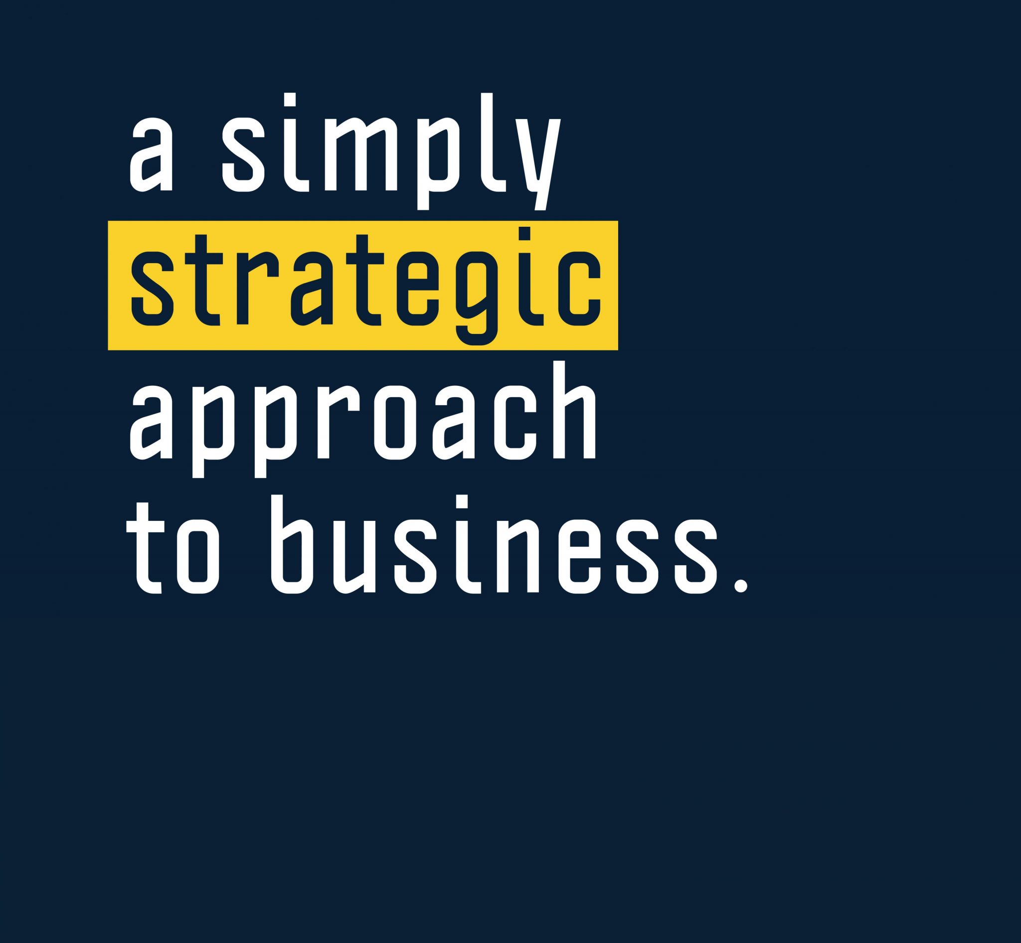
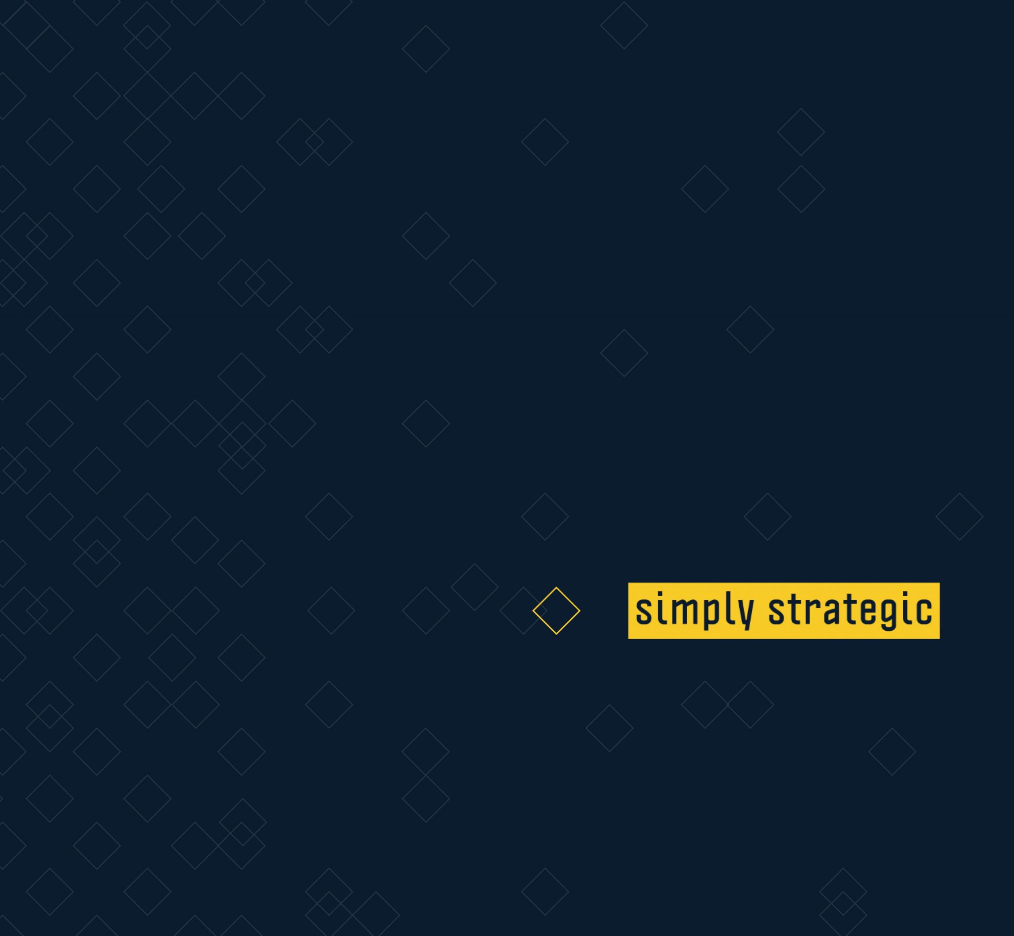
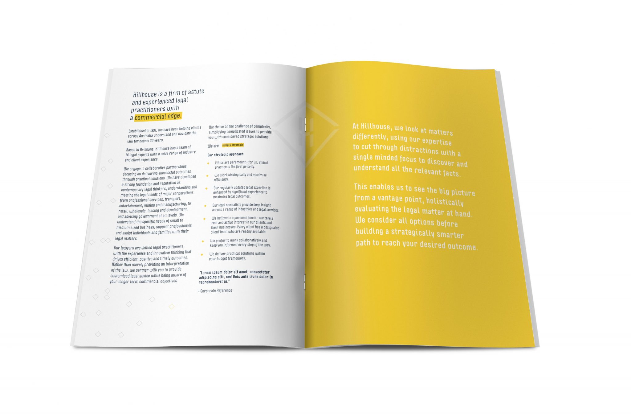
The positioning strategy is built around the idea of cutting through the confusion and legal jargon that is associated with the legal industry and make their offering simply strategic.

positioning strategy explanation - vantage point view and position of strategic advantage
brand and positioning strategy designed in brand identity by Australian brand agency DAIS

Naming Strategy

Hillhouse is the name of one of the founding partners and colloquially used in the industry. However, a ‘hill’ ‘house’ means a place with a 360 degree holistic view that is a position with strategic advantage. Renaming the brand ‘Hillhouse’ reflects the firm’s proud heritage while also crafting a unique brand story that competitively positions the brand.
‘Legal Partners’ was integrated to reflect their collaborative client approach to create Hillhouse Legal Partners.
positioning strategy statement - a simply strategic approach to business

Positioning Strategy

Underpinned by the brand strategy, we crafted the brand promise ‘simply strategic’ to highlight Hillhouse’s skill in cutting through complexity to find the simplest strategic solution. The positioning strategy is strengthened with the use of the highlight in the visual design, which reflects how they find the optimal point of simplicity to provide simply strategic advice.
visual identity design with brand promise - simply strategic designed by Australian brand company DAIS

Visual Identity

Graphically, the cut and yellow dash through the logo represents the process of Hillhouse cutting through clutter and the defined path the firm takes to deliver optimised solutions. The colour palette comprises of the yellow cutting line and navy from the original design along with Politica type – a sturdy, modern and straight-to-the-point typography that is reflective of Hillhouse’s professionalism.
office signage after rebrand strategy
PICA award for presentation folder designed by Brisbane brand agency DAIS

Award-Winning Collateral

Hillhouse’s presentation folder won a Silver Printing Industry Creativity Award in 2019 for its incorporation of a spot UV and a deboss of the brand’s icon. On the interior of the folder, the business cards are positioned on a highlighted pocket with die cut diamond slots, which point to the names of the legal team.

Brand Implementation

Transforming the business by implementing their new brand involved new office signage, office stationery in brand colours, corporate brochure, presentation folder, website and capability statement.
corporate collateral design and production by Australian brand agency DAIS
corporate collateral designed by Brisbane brand advisors DAIS to demonstrate brand positioning
corporate collateral design by Australian brand advisors DAIS
business card design with brand and positioning strategy for HIllhouse

I look at where we were, where we are now and what we’re continuing to achieve, it all started with the brand and that’s what we had to do first. Overall, we couldn’t be any happier with the outcome, we just love our brand, the results speak volumes, and it really works so effectively.

Karen – General Manager Hillhouse

Outcomes

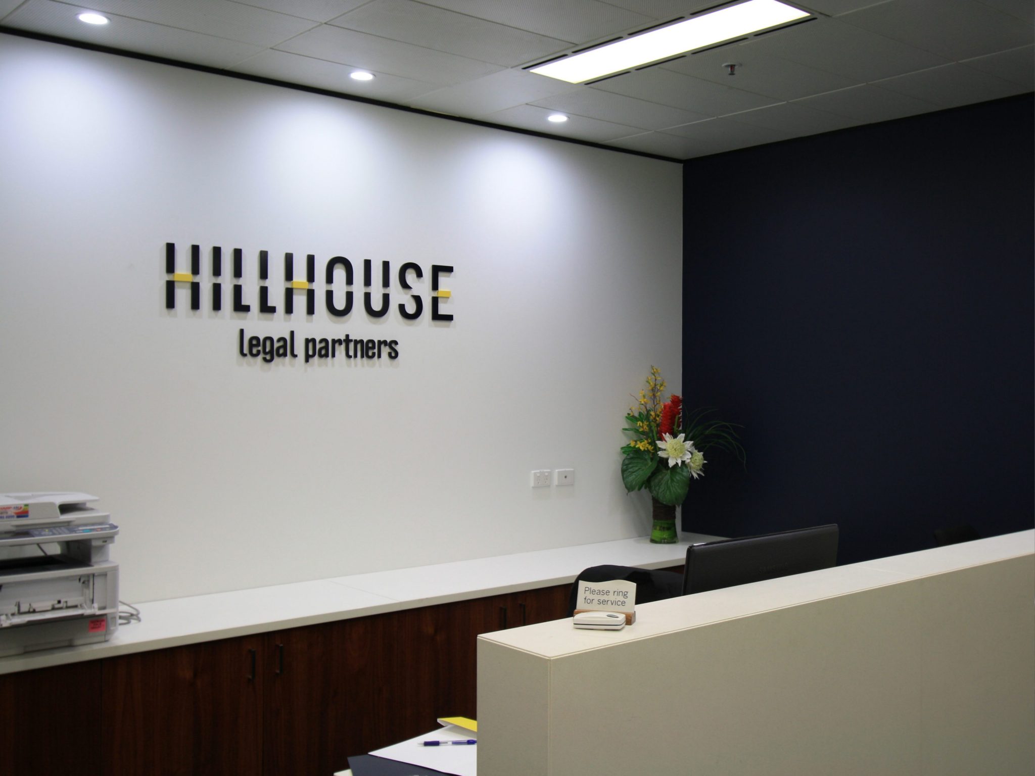
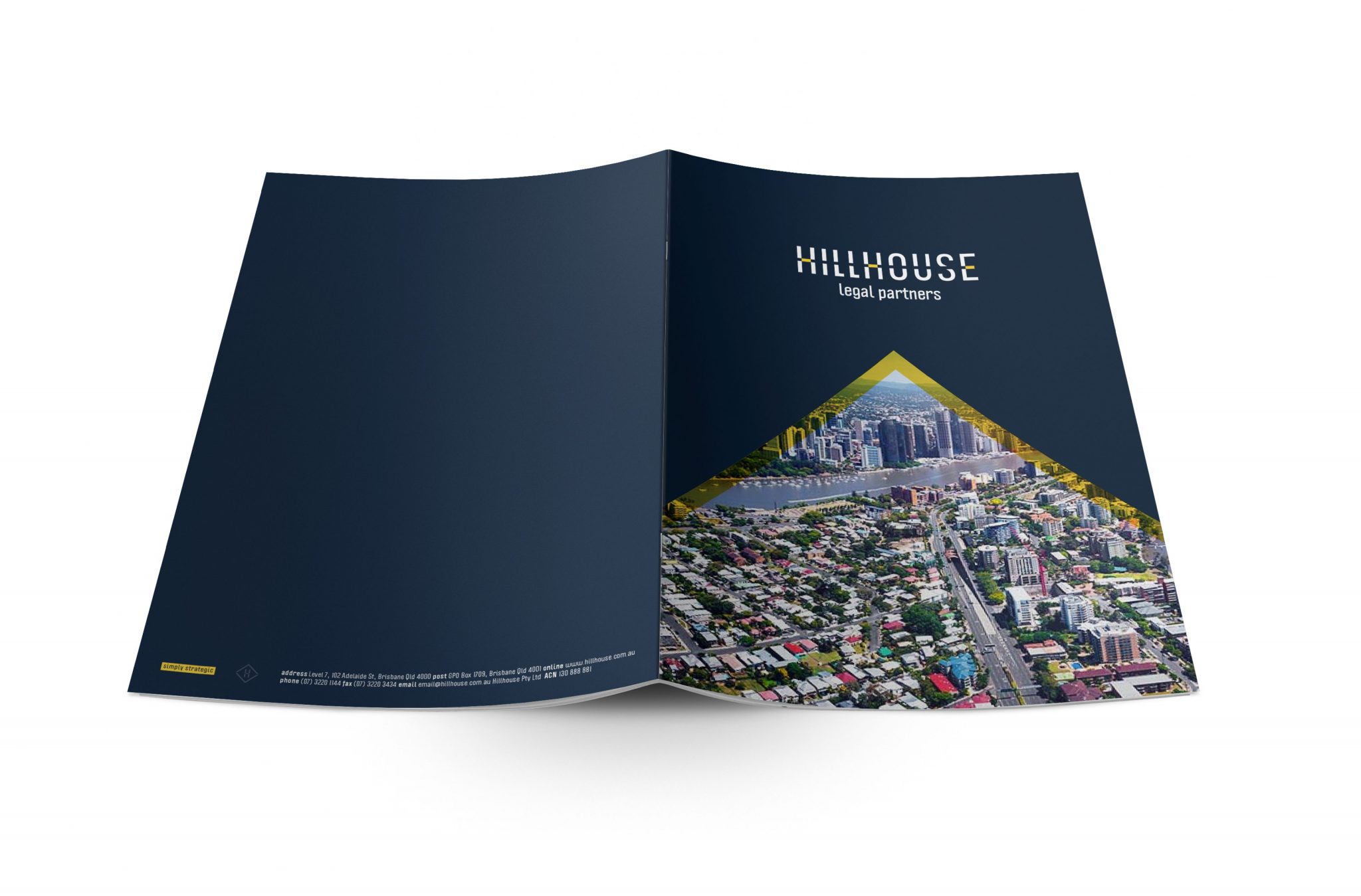
Hillhouse Legal Partners has launched their new brand, strengthening their identity in a competitive market and positioning them for future growth. Since launch, they have attracted excellent talent and new clients across diverse areas and sectors, as well expanded their capabilities to service Australian and Internationally listed companies.

Need a new brand to align with strategic business direction? We take our clients through our process to understand who they are, who they want to be and how to get there through strategic brand-led solutions. Connect with us.

Similar projects

Timelapse photo of highway with filter - brand visual identity

Mullins

Branding
Seneworth Legal Partners Logo

Seneworth

Visual Identity Design
Click me for a free brand health report!

Step 1 of 11

  • Our brand name is unique in our industry and marketplace.